A+E Networks
Catalog: Video streaming application
Project Summary
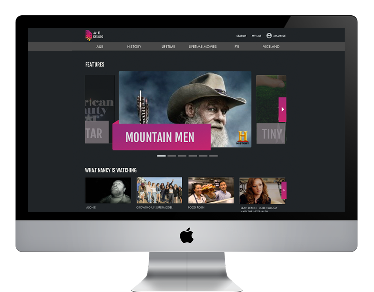
Designing a POC video streaming application housing all A+E Networks content
Meet The Team
TechLab is an in-house research, design, and development group which finds opportunities to use technology to enhance the global business of A+E Networks.
My Role: UX Designer
The Team: Product Manager, Design Team Lead, UI Designer, Dev Team Lead, Front End Developer, Back End Developer
Who's the boss?
A+E Networks is a conglomerate, made up of 10 networks and 52 global networks. Most notably, A&E Networks, Lifetime, History Channel, and Viceland. As of 2014, the business is valued at $26 billion.
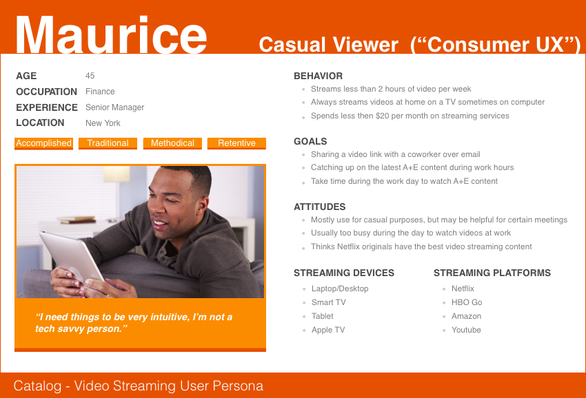
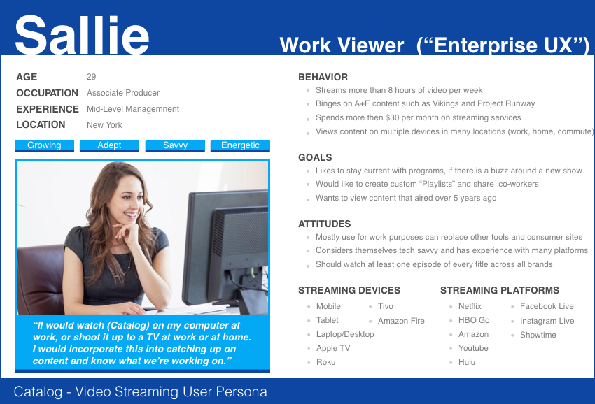
MEET THE USERS
A major goal of the business was to increase employee engagament by stregthening the A+E brand. This video streaming product, where all networks' content would live together, was inline with this company goal and became a high-profile project with C-suite interest and oversight.
Opportunity Comes Knocking
Prior to Catalog, there was no way to access all A+E content in one place. A+E employees were using consumer apps for daily work purpose even though those products are not designed for enterprise use.
How might we create an equal experience for both the "enterprise" user and the "casual" user?
One of Techlab's design principles is empathy – put yourself in your user’s shoes, understand their challenges, perspectives and needs.
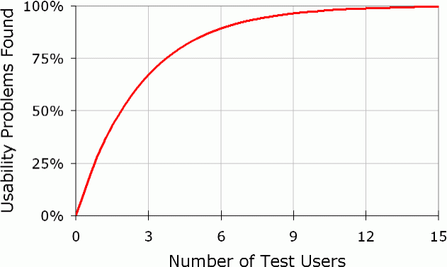
Working in enterprise presents both perks and challenges. One perk is that the users are in the same building or accessible via skype. However the formal culture presents a major challenge when recruiting users, as it requires manager approvals to pull an employee away from their work.We strive to test between 5 users (the minimum) and 15 users (the maximum).
User Research Strategy
Card Sorting – June 2017 – 13 participants
User Testing Session 1 – July 2017 – 7 participants
User Testing Session 2 – September 2017 – 6 participants
User Testing Session 3 – October 2017 – 6 participants
Card Sorting found...
“Type” and “Genre” were used synonymously
62% of users think of “Brand” first when categorizing programming
85% of users frequently categorized content in the same group name order:
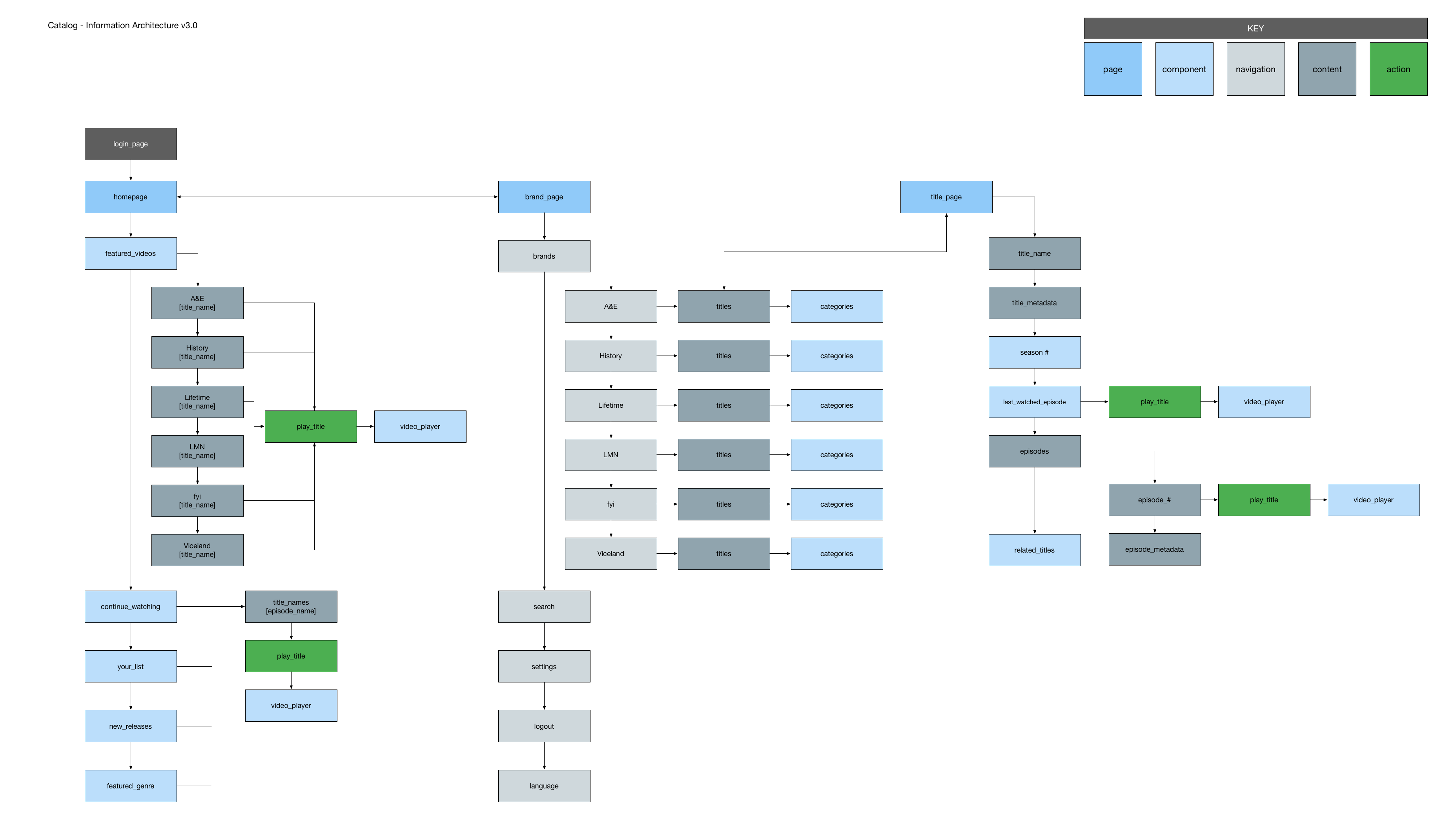
1. “Brand” > “Genre/Type” > 3. "Title" > 4. "Episode"
We were inspired by the recent release of NBC's new tech, science and innovation vertical, MACH . They built a design system, from the outside inwards, first designing components and pieces where you could take big swings. They also made a point to avoid overly structured templates. So we took a big swing, designing video components first.
We tried to break out from the assumptions of what a title card SHOULD be and went back to asking basics. Why does a user click on a video card? What elements drew them in? What elements did they ignore? Do video cards have to be the ratio of a video to be recognized as a video?
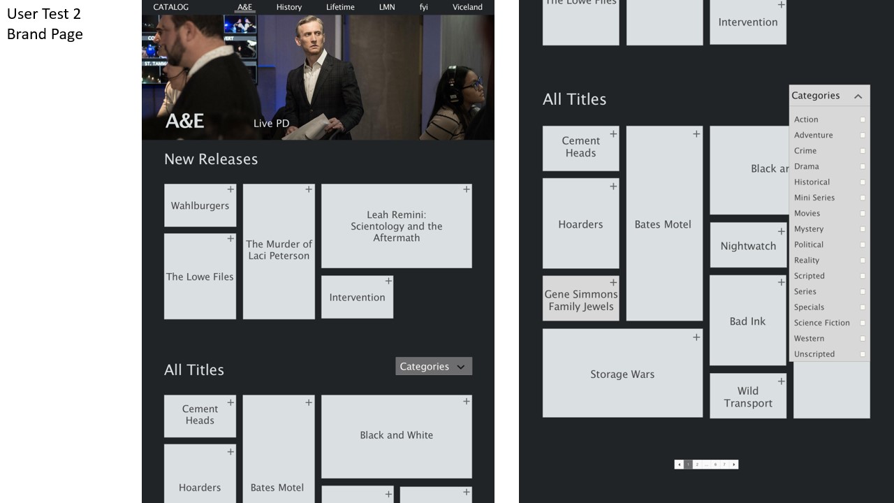
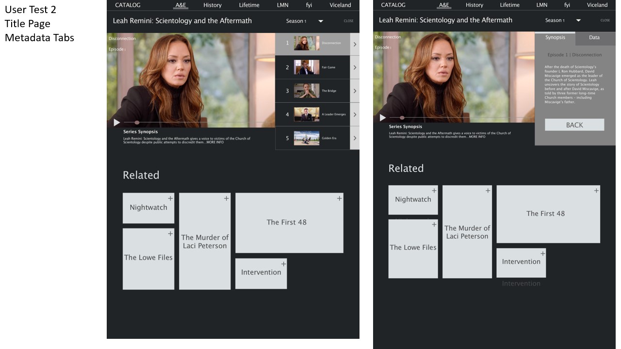
After ideating with component structure, we tested a mosiac layout on the brand pages for enhanced discoverability and a split-screen convention (similar to Youtube) on the episode pages for the enterprise user.
And we found...users prefer full screen when using Catalog; split screen was more fitting for short clips
The Mosaic was a huge failure: though it enhanced Discoverability it decreased equal presence and did not resonate with the user. It also enhanced technical difficultly beyond MVP status
Round 3 Testing – Major Takeaways
Validated card carousel – 100% of users swiped through more than 2 cards
Sorting and Filtering were both major pain points with all users
Strong desire to filter and view all A+E Content
Users questioned what content would be available on the application
80% of users cited no immediate need for metadata within the application
Base: Why a dark background?
+ Mimics a “movie theater” atmosphere, reduces distraction from video content
+ Creates additional layer of drama
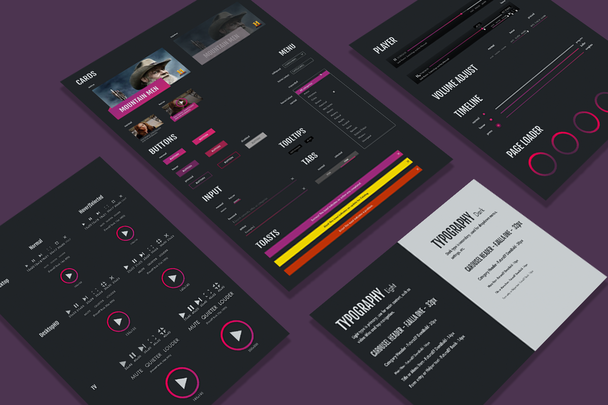
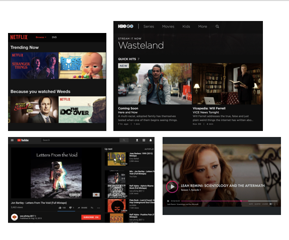
+ Dark backgrounds encourage our minds to recall symbols. Catalog is in part a tool designed to aid employees in quicker brand/content association, and a dark background make logo recognition easier.
+ We see this across most major video applications: Netflix, YouTube (just switched to dark theme), Hulu, and so forth.
And so the story ends...
Catalog was presented to stakeholders, succesfully proving the need and desire for such an application at A+E Networks.
