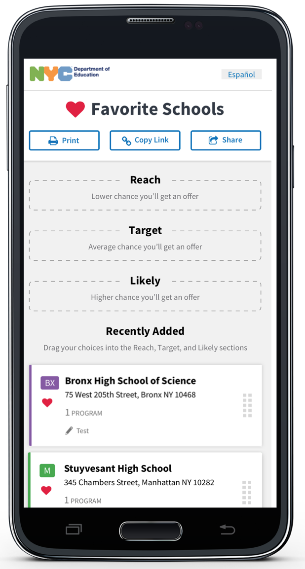
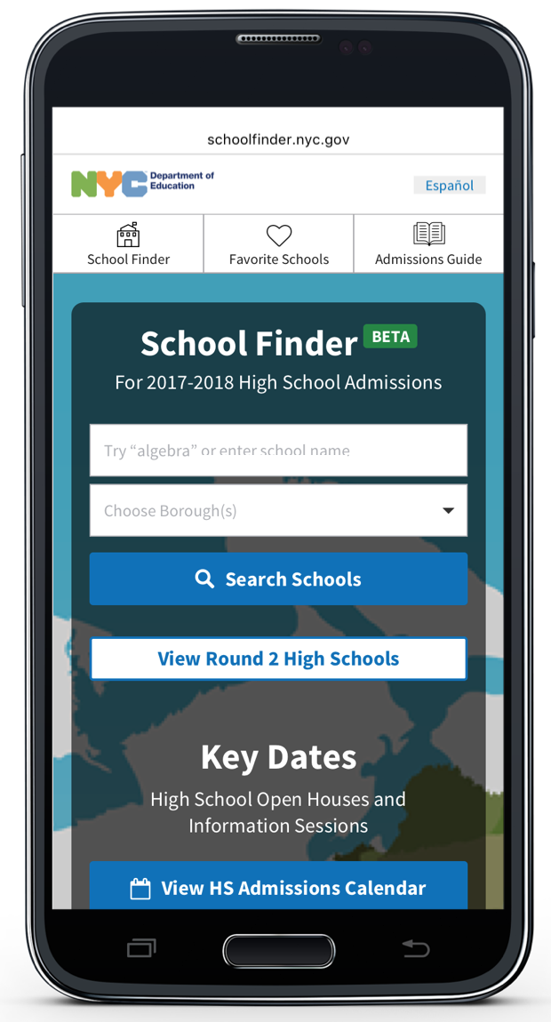
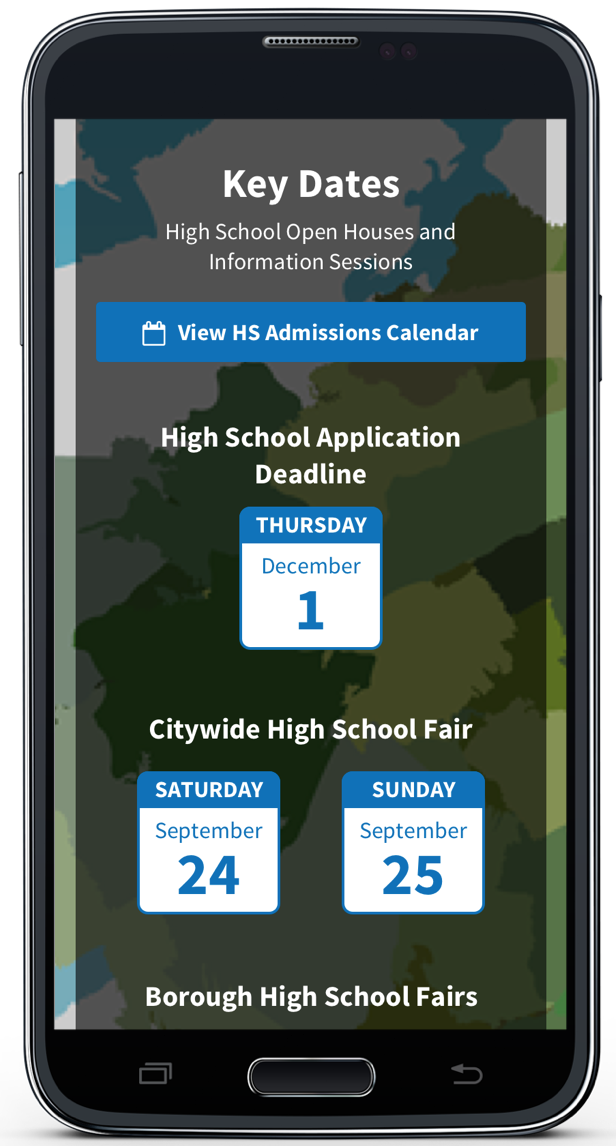
Department of Education

ROLE:
Research Lead + Project Manager
Collaborators:
Eddie Shrake + Jenny Lin
Timeline:
3 Weeks
Project:
NYC SchoolFinder Progressive Web Application
Summary
In spring of 2017, I had the opportunity to work with the NYC Department of Education Department of Student Enrollment. I led the research efforts for design recommendations for NYC School Finder 2.0. We presented our designs to senior policymakers at the DOE headquarters in May 2017.
The Opportunity
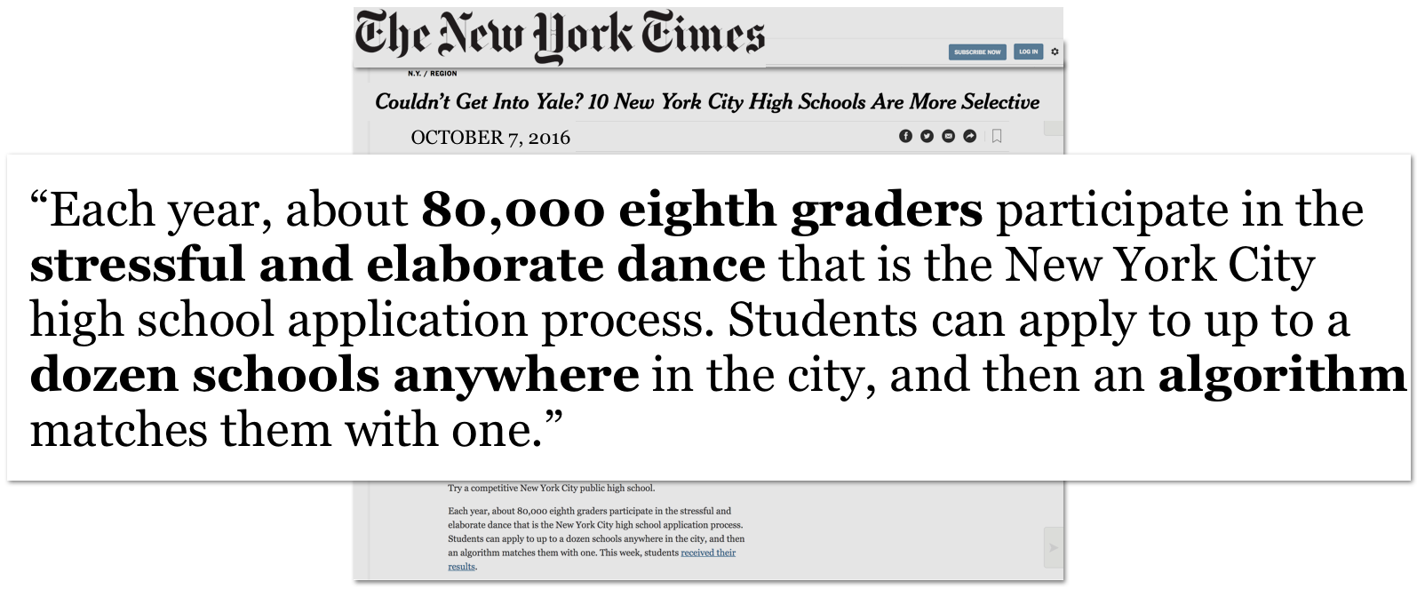
In New York City, students are given the rare opportunity to apply to up to twelve programs in any of the 5 boroughs. Though students can list up to a dozen programs on their application, research shows that in 2016, they listed on average 6 or 7 – making it less likely that they would receive a Round 1 offer.
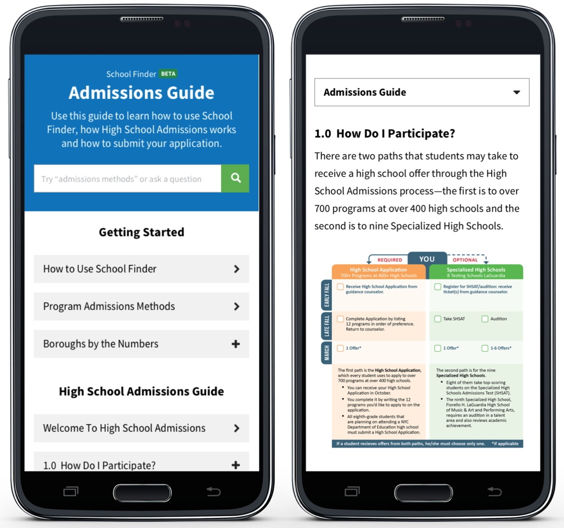
We had the opportunity to take SchoolFinder to the next level, making it not only an online, interactive directory– but also a guide.
How might we increase the number of programs families list, increasing their chances of getting a round 1 offer?
The Discovery
The New York City Department of Education is the largest school district in the U.S. serving over 1.1 million students in nearly 2,000 schools. New York City has more than 400 high schools and over 700 programs. And students apply directly to programs, not schools. Using books, articles, and previous research from the DOE, we discovered the complexity of the debate about the city and country’s education system.

In 2004 under Mayor Michael Bloomberg, a universal high school choice process was implemented. Under this system, all incoming high school freshmen are required to rank up to 12 programs they would like to attend. There is no default school assignment, meaning everyone has to choose.
Students can list 12 programs on their application.
Listing fewer than 12 programs works against you by making it less likely that you will receive an offer from your application.
97% of students who listed 12 programs on their application received an offer to a choice on their application.
Existing School Finder Usage (9/12/2016 - 12/1/2016)
Total Users: 53,891
New Users: 44%
Mobile Users: 32%
Session Duration: 00:07:55
NYC Mayoral Policy
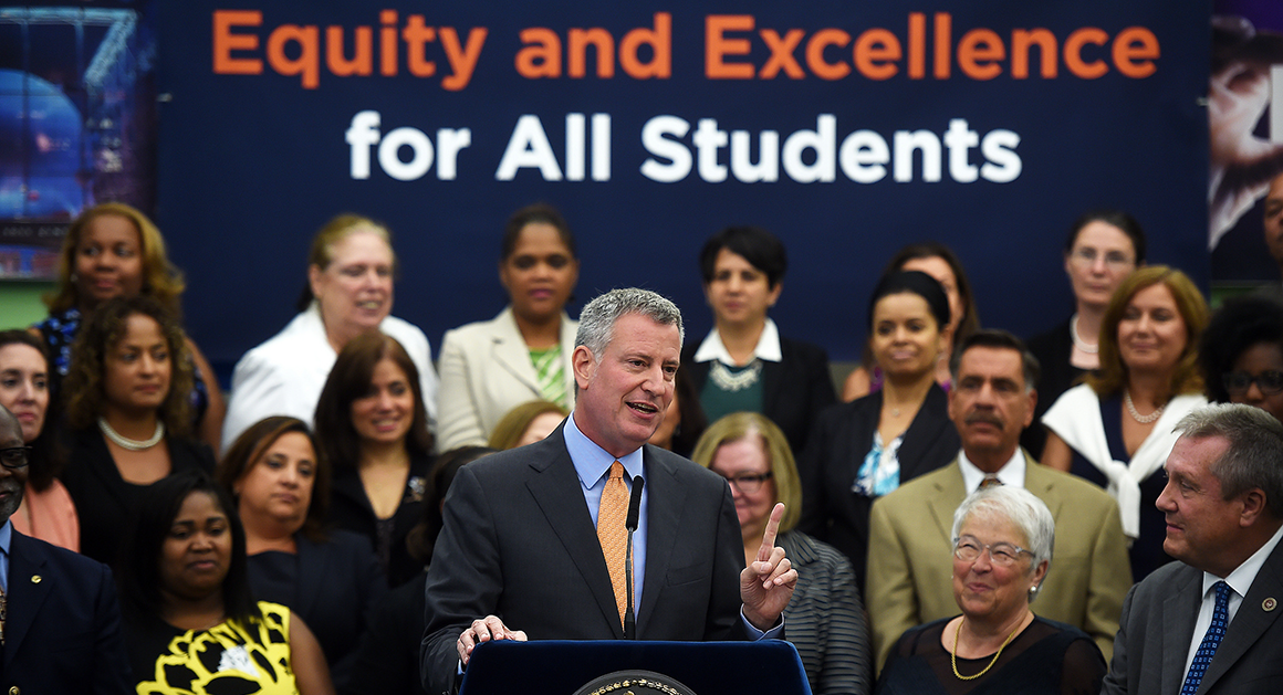
Mayor De Blasio’s Equity and Excellence initiative meant that our designs must give everyone what they need to be successful. We worked within the perameters of limited accessibility and data usage for low-income families. New York City is socio-economically diverse, with 76.5% of students qualifying in poverty.
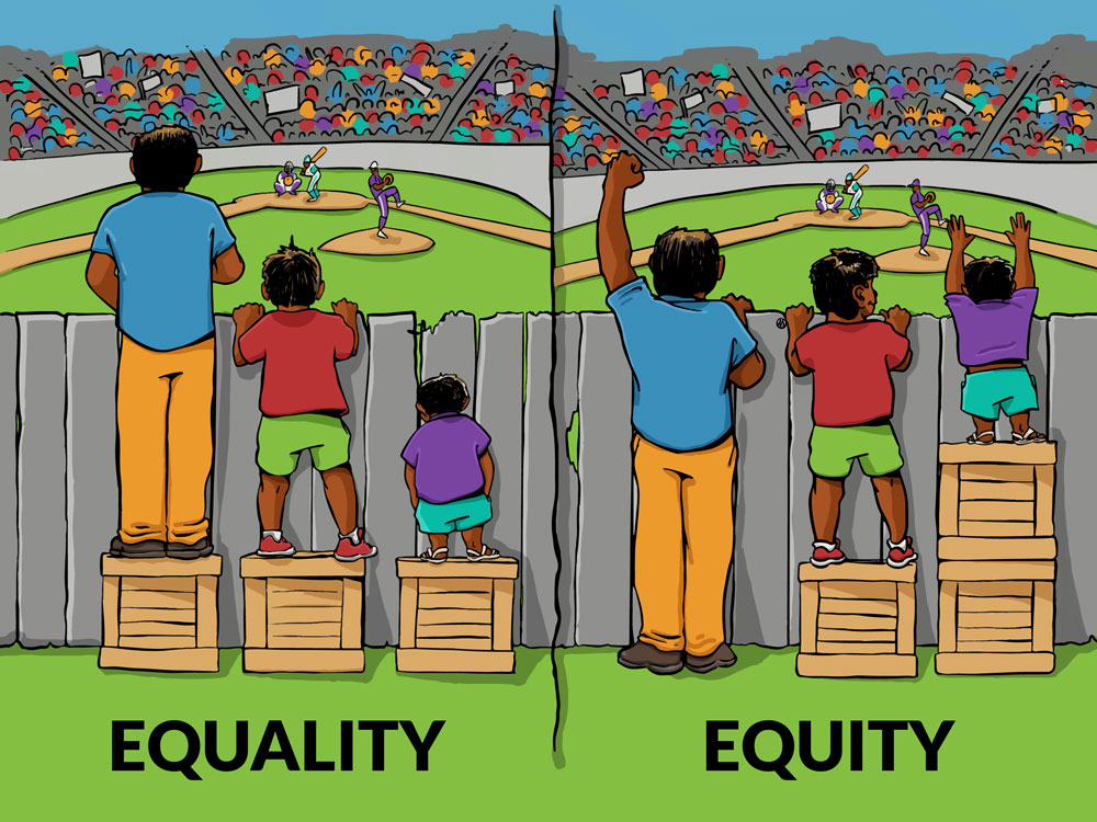
We clearly defined the difference between equity and equality. Equality meant giving each student equal opportunity, while equity means factoring in the positioning and resources of a student, lifting up the student who needs it most. We measured each design choice to align with the mayoral equity policy.
“It’s a priority for us at the Department of Education to make the enrollment process easier for families”…“That’s really a part of Equity and Excellence [the mayor’s education agenda], ensuring that families have access to quality information in as easy a way as possible so they can make the best choices for their kids.”
– Josh Wallack, Deputy Chancellor, NYC Department of Education
Smartphone ownership is often most financially tenuous for the subset of users who depend on their mobile devices most heavily.
As of 2015, early two-thirds of American adults 64% own a smartphone, up from 58% in 2014
Smartphone owners with income of less than 30,000:
44% have had to let their service lapse at some point or another
43% max out on data usage frequently
19% do not have broadband at home
24% have few access options other than cell phone
13% are smartphone-dependent
The Process
DOE Provided Research

The DOE provided audio and transcripts of 24 past interviews and usability tests which led to the current MVP. We learned about the frustrations understanding the admissions and selection process. And that this was a pain point for educators, students and their families.
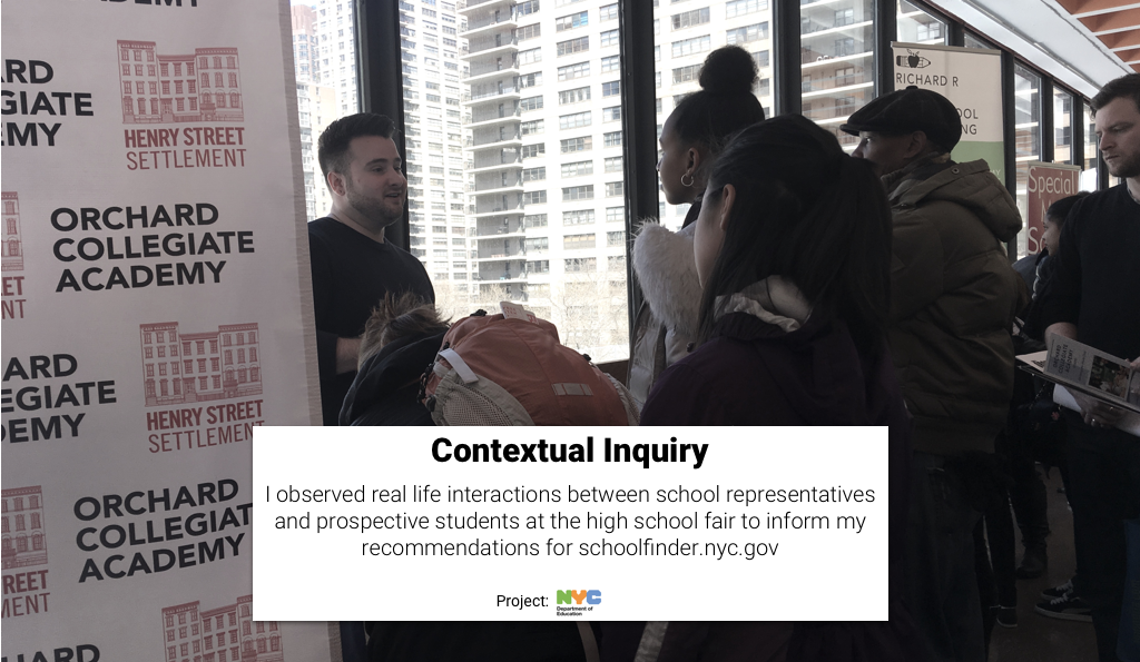
Contextual Inquiry
What: Round 2 high school admissions fair
Where: Martin Luther King campus on Upper West City of Manhattan
Observed firsthand how difficult it is to navigate and track programs of interest
Learned nothing can replace seeing a school in person or speaking directly with
programs representatives
User + Stakeholder Interviews
3 DOE staff members | 4 Guidance Counselors | 3 Parents
BACKGROUND
Can you tell us a bit about your background and how you came to be a guidance counselor?
ADMISSIONS PROCESS
When do you typically first meet with families and/or students?
When you first meet, what are the students/families initial understanding of the admissions process and their options?
How do you educate families and students about the admissions process? What would help you educate them on the the process?
How do you motivate students throughout the admissions process?
What are the main factors families and students consider when selecting a HS program?
12 PROGRAMS
How do you explain the 12 programs application to students?
How do you motivate and encourage families and students to list 12 choices?
APPLICATION DIVERSITY
What do you do when a student comes to you about their chances of getting into a specific program?
How do you break down reach/ target/ likely school options to students?
DATES + DEADLINES
What are key dates / deadlines that students and families need to know?
How are students/families reminded about key dates?
SCHOOL FINDER 1.0.
Tell us about your experience with School Finder since it was released.
At what points in the process do you use School Finder? How has school finder been useful to you?
What can be added to School Finder that would make your job easier?
FINDINGS
We found that the needs across the 5 boroughs vary greatly based on location, socioeconomic makeup, ethnicity, and other factors.
User Map of Admissions Process

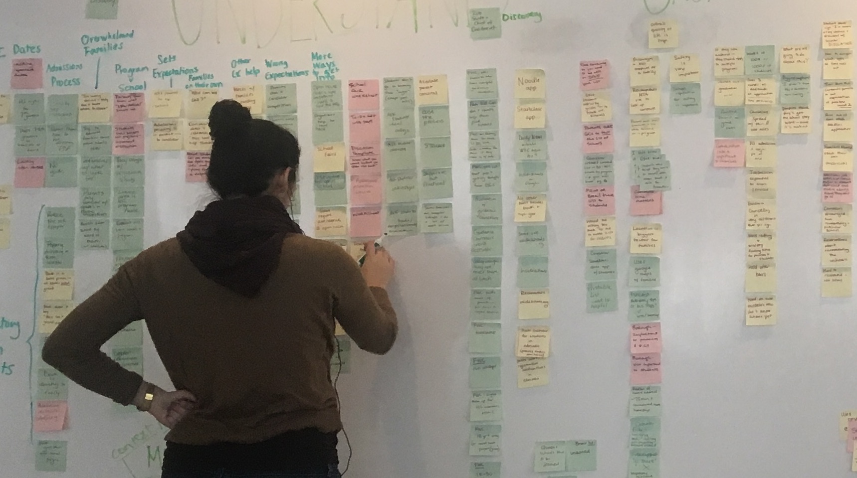
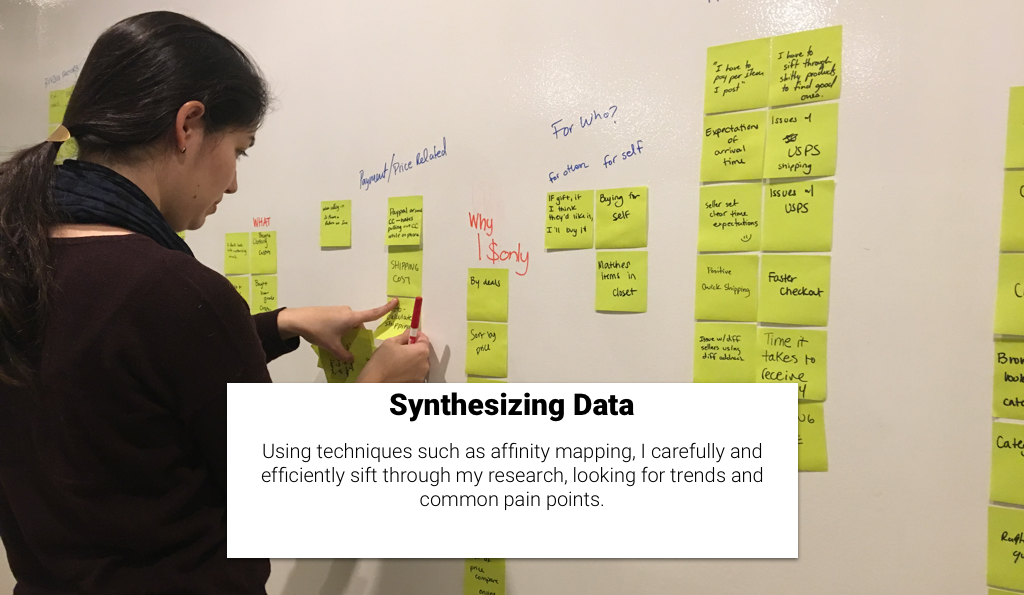
From our findings, we created a simplified user map and found students and families have questions throughout the entire yearlong admissions process.
Summary of Research Findings
DOE NEEDS
Want families to understand the process and list more programs on the application
STUDENT AND FAMILY NEEDS
Want their questions answered throughout the process and easily track programs of interest
GUIDANCE COUNSELOR NEEDS
Want to educate students and families about the process and promote application diversity
Feature Prioritization
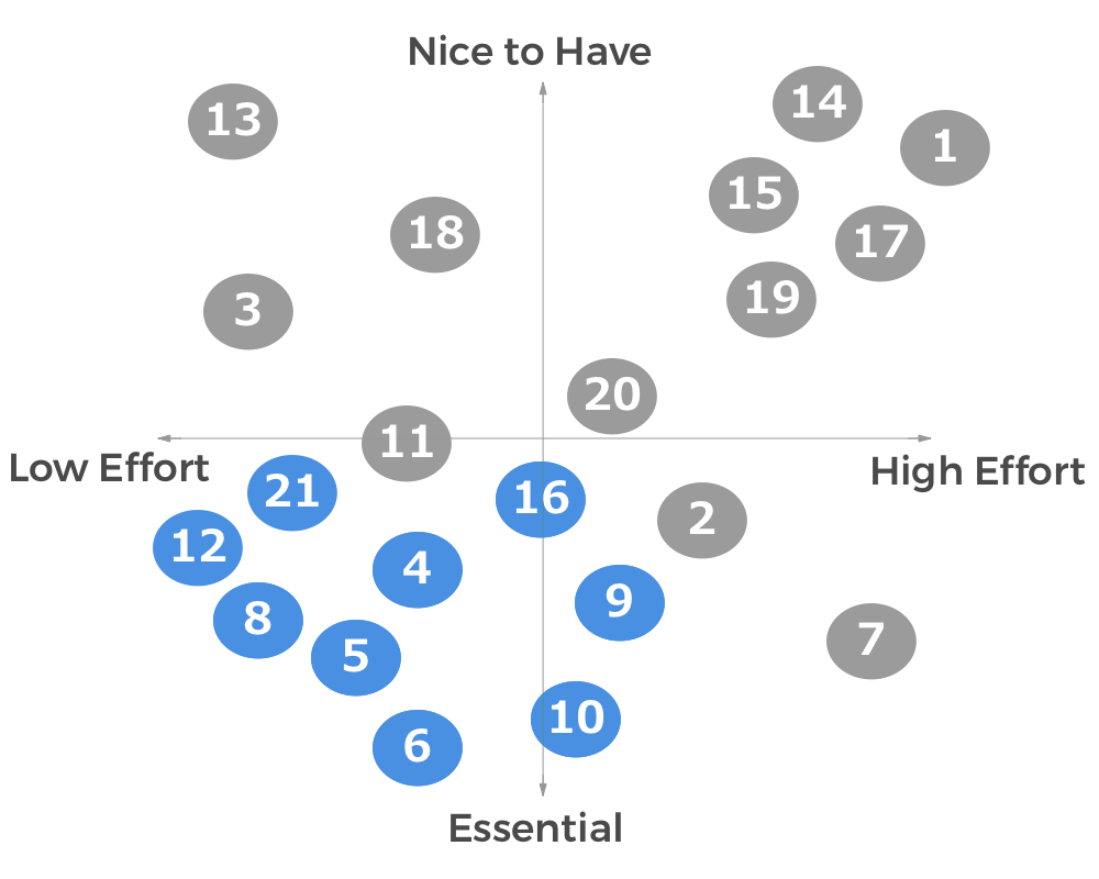
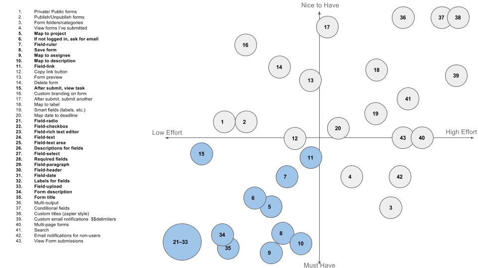
We ideated on a large number of possible features, using the Moscow method below to identify an MVP.

Design Studio
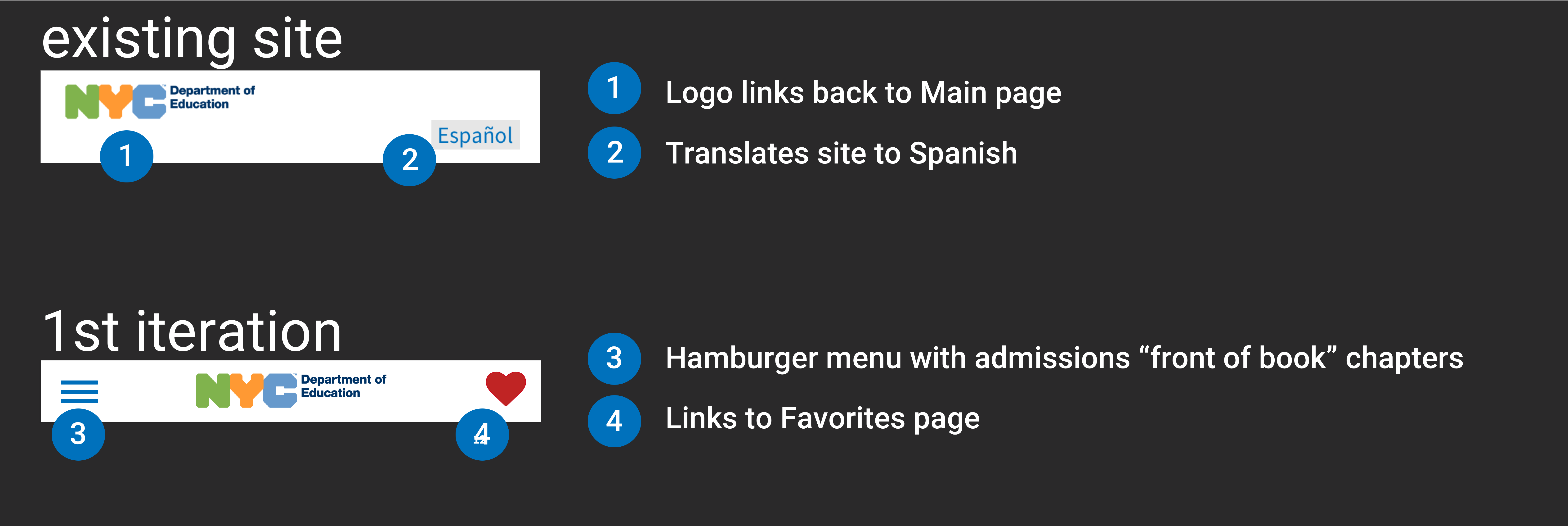
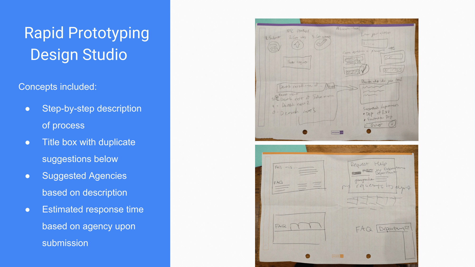
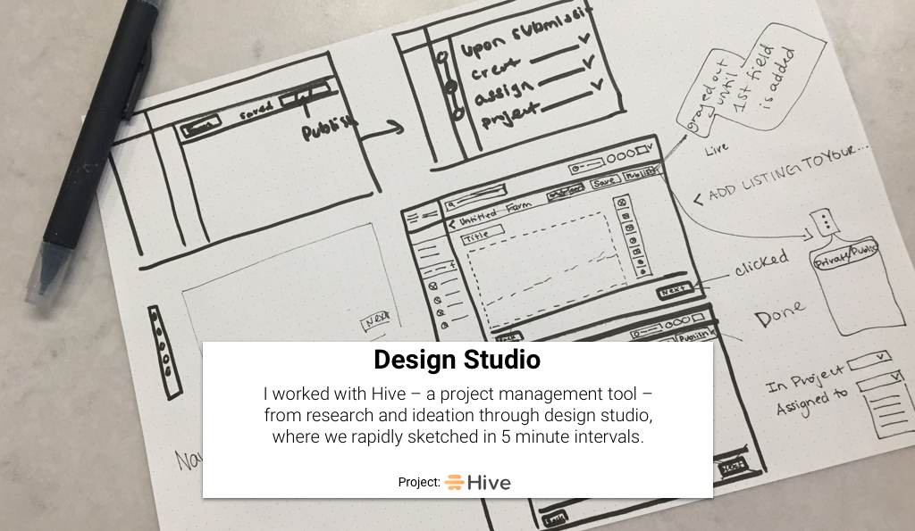
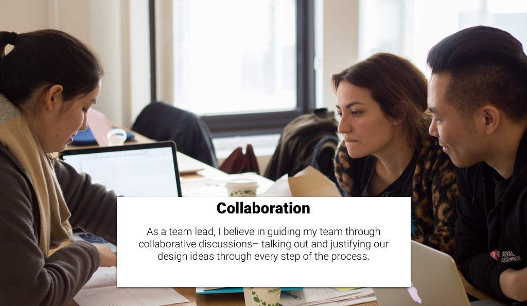
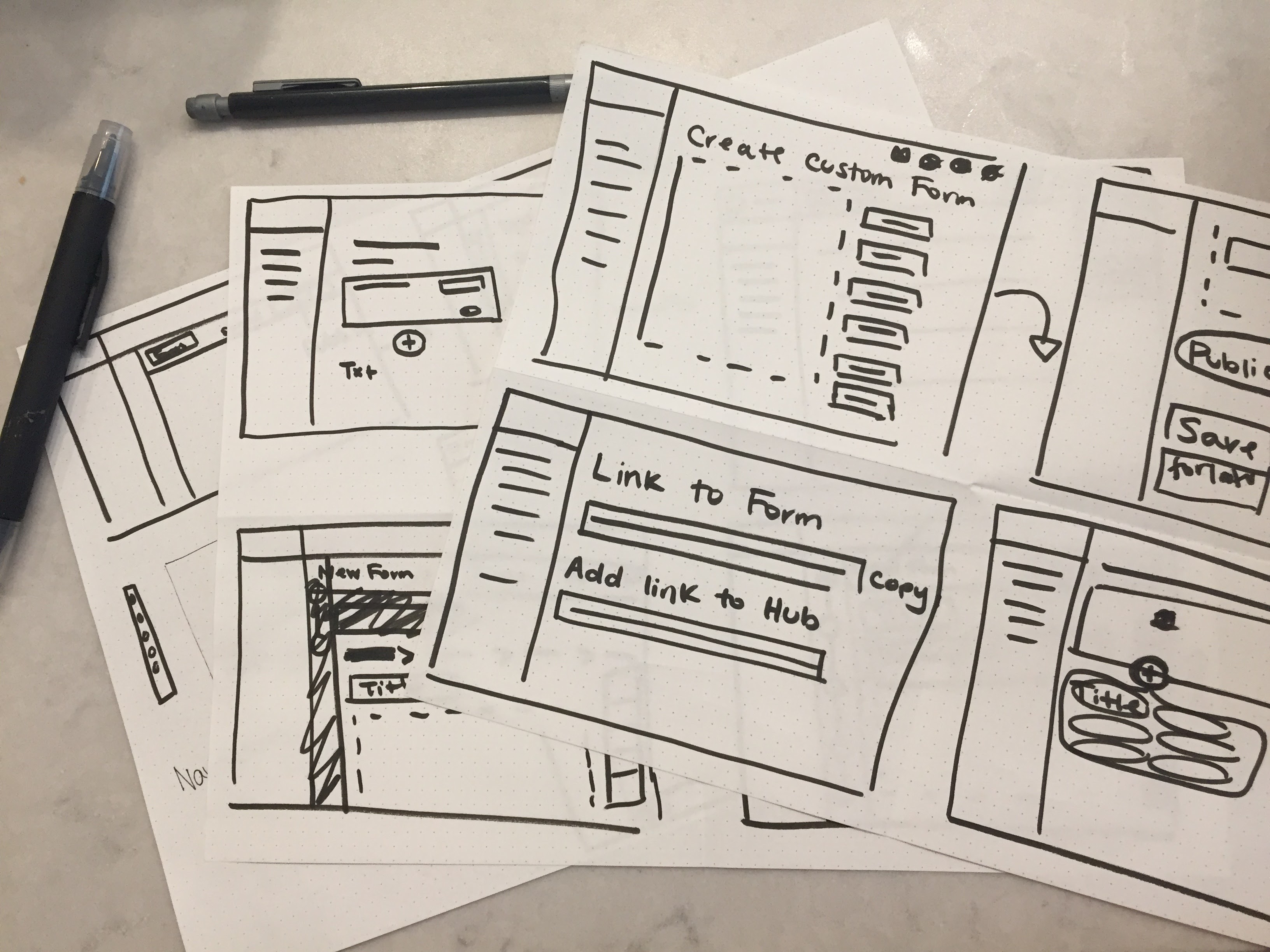
My team ran a design studio, where we rapidly hand sketched our initial design ideas in a collaborative fashion, deciding on a final first iteration together.
Usability Testing
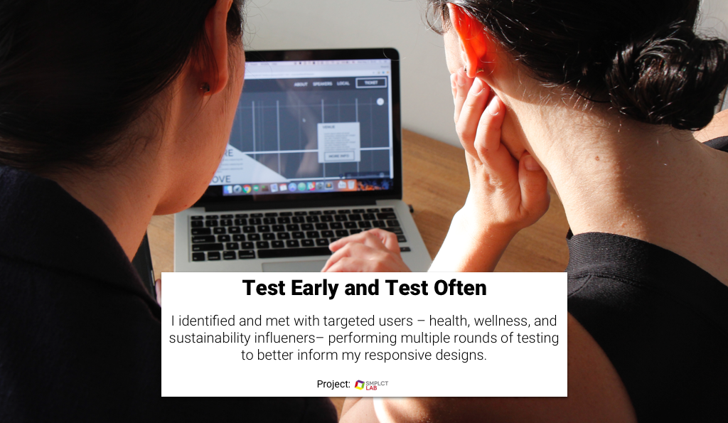
We followed the golden rule– test early and test often.
Using a survey and our networks, we identified 9 target users who have or will go through the NYC high school admissions process.
We did 4 iterations and 4 rounds of testing.
