SMPLCT Lab
Designs for 2017 Exposed Conference
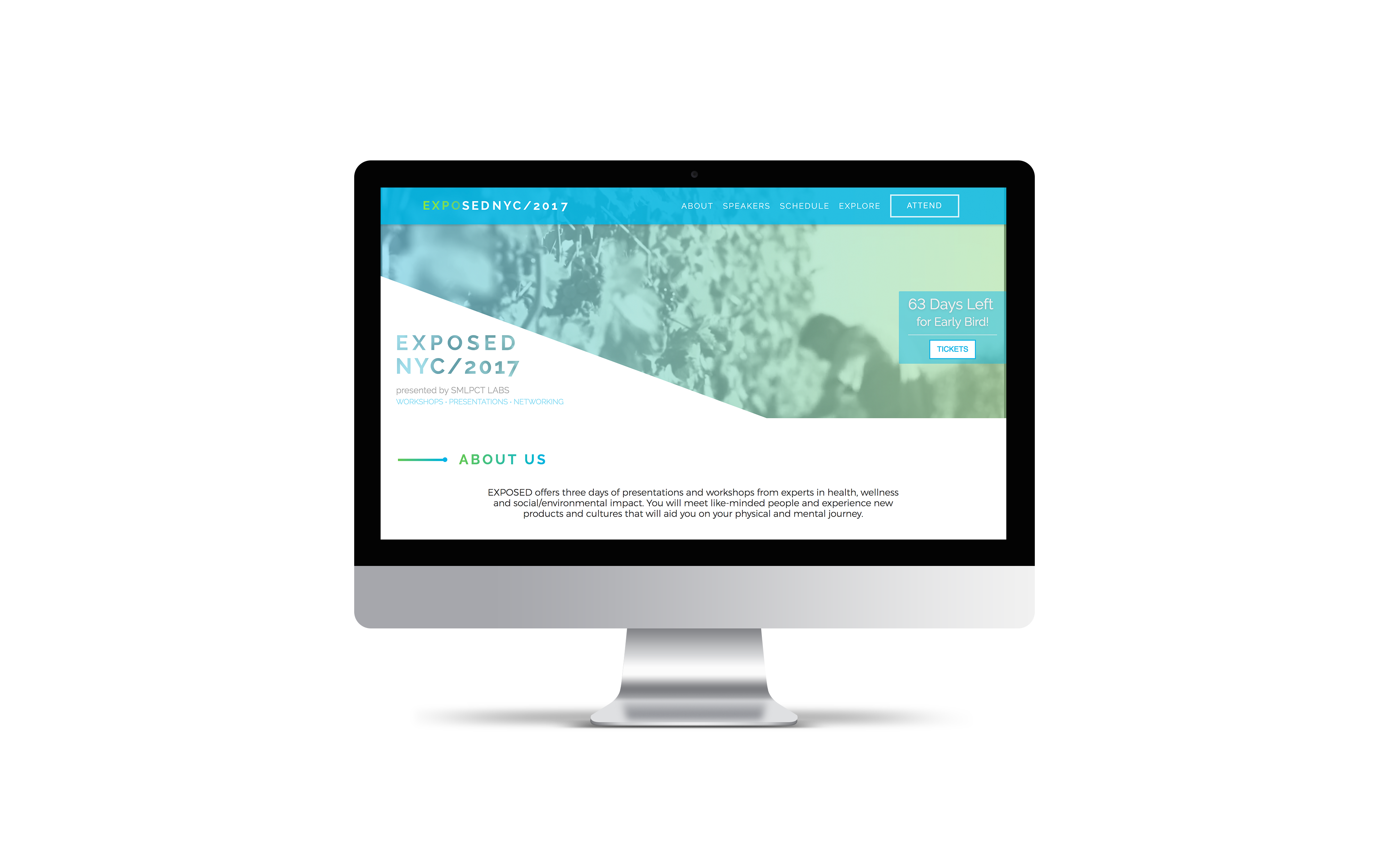
Check Out The Live Site Here
Meet The Opportunity
My team was tasked with designing and developing a responsive website for desktop and mobile devices for the Exposed 2017 conference.
Meet The Team
My Role: UX Research Lead
UX Team: Kelsey Nash, Philip Park, Caleb Kenney, + Jenny Lin
Dev Team: Marcel Hamel, Tim Frankie, Alessa Messineo, + Joe Kitaj
Meet the Client
SMPLCT Lab is a global design firm who works with international clients to find unique solutions to social impact issues.
SMPLCT Lab hosts an annual 3 day conference called Exposed; this conference focuses on health, wellness, and social impact.
How might we create a comprehensive site experience that emphasizes user-focused features for conference site users, measured by an increase in ticket sales?
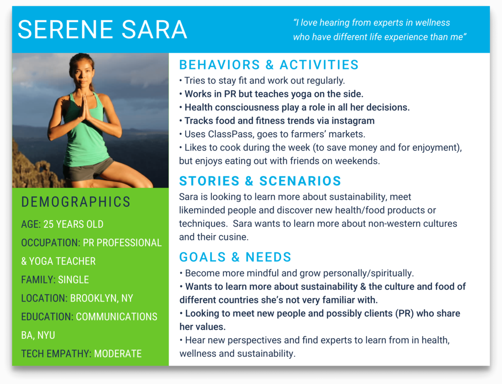
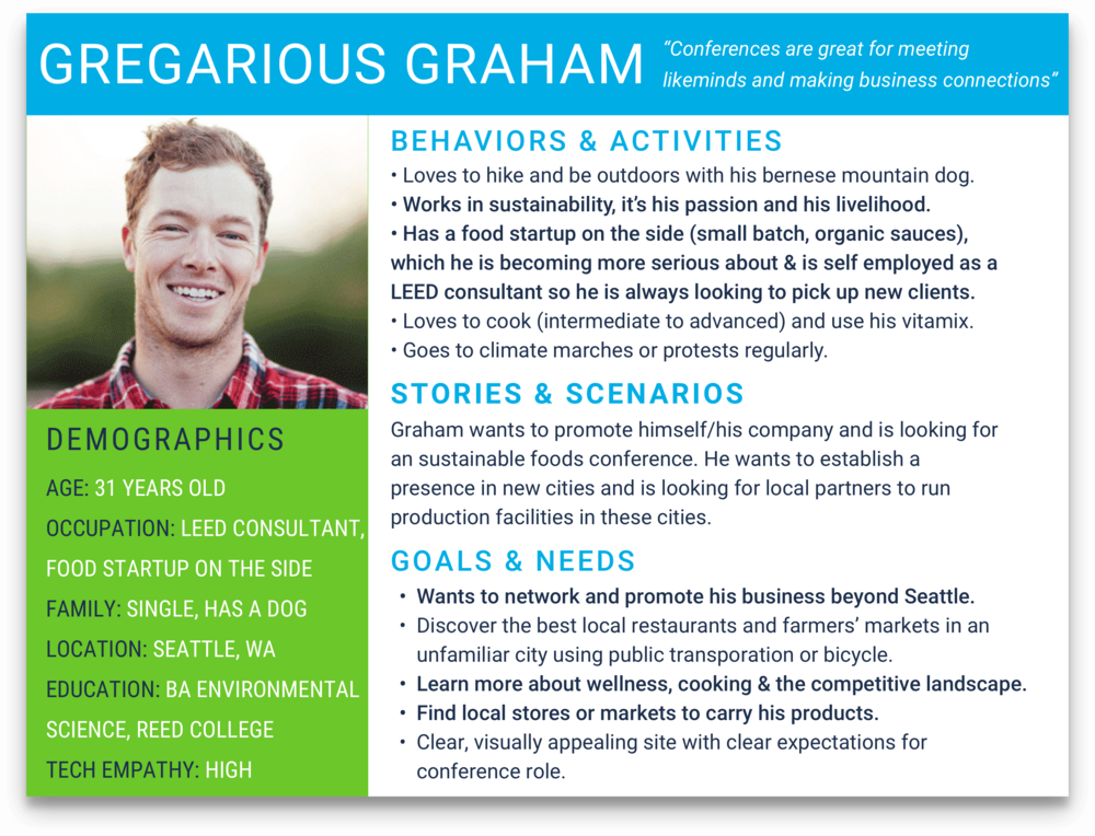
SITE USERS
HOW WE LEARNED ABOUT THEIR BUSINESS NEEDS
We spoke with...
And We Learned...
EXPOSED CONFERENCE MISSION
To expose the truth around food, nutrition, and the impact from what we consume has on our lives (mental/physical) and how that relates to society
WHO IS EXPOSED FOR?
BUSINESS PAIN POINTS + NEEDS
1. Defining the focus of their conference
2. Wanted website to highlight New York City
3. Wanted a quick visual representation of the Exposed mission
Sizing up the competition
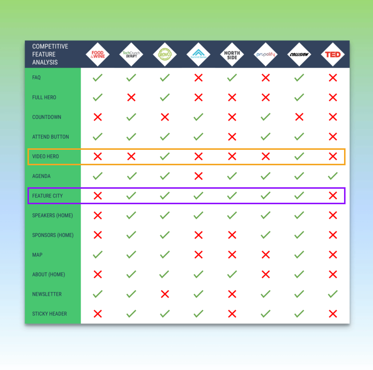
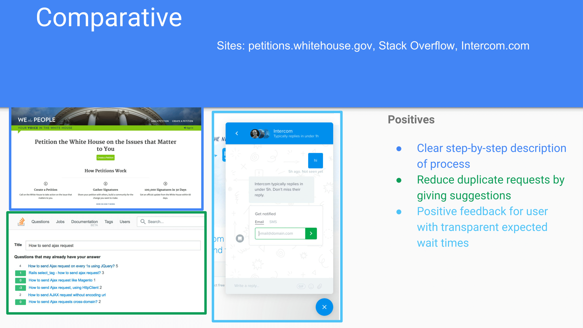
Through Competitive Analysis, three features jumped out to us.
We noticed that only 2:8 sites utilized video heros, a popular trend in web design. We saw this as an opportunity to let the website reflect their modern branding. But first, we needed to check the latest the data when utilizing a hero to see if it was right for Exposed.
Is a Hero Image Right for Exposed?
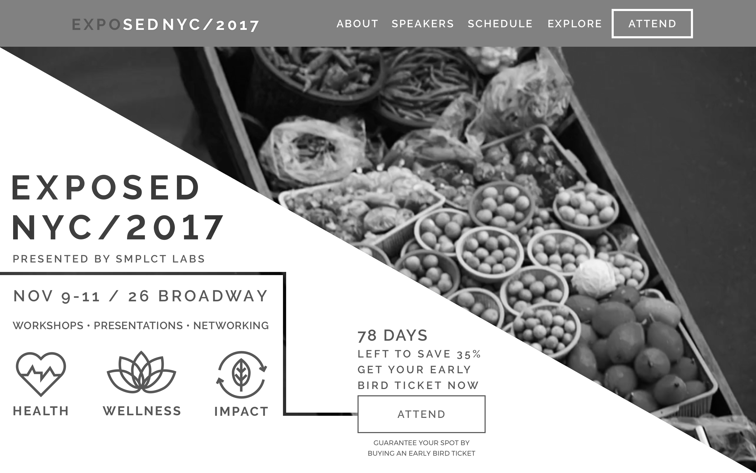
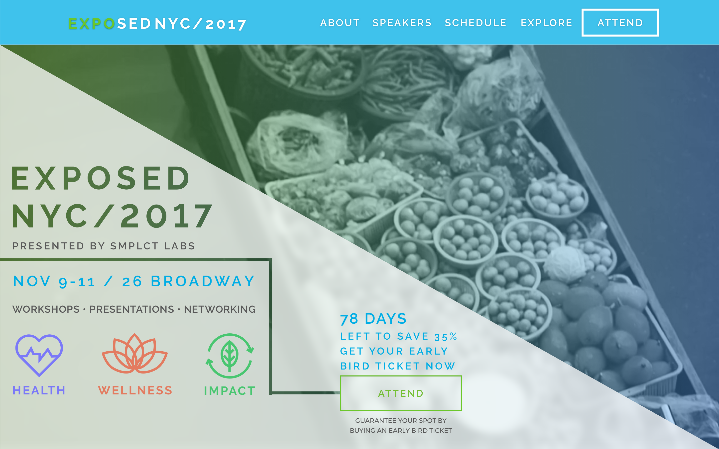
According to several studies, it takes 50 milliseconds for users to form an opinion after about a website and users spend 80% of their time above the fold. Through usability testing, we found that these findings rung true: users spent significantly more time on the hero than the rest of the website.
Utilizing a hero image provided a huge opportunity to showcase this lesser-known brand as soon as the user landed on the site to grab attention, thus decreasing the bounce rate.
The other influential feature was possibly using a single page, infinite scroll. With 7 of the 8 conference sites following this trend, we felt more confident in the success of this feature but it never hurts to have numbers to back you up!
Is Infinite Scroll Right for Exposed?
According to Nielsen Nelson Group, a continuous scroll is effective when content has a flat hierarchy. Based on the business needs (including sponsors on main page, highlighting location) and varying user needs (location, speakers, agenda, price), the many site sections all carried similar weight, warranting a flat hierarchy. Based on this, we also choose a sticky navbar to ensure the user had increased findability to all the sections.
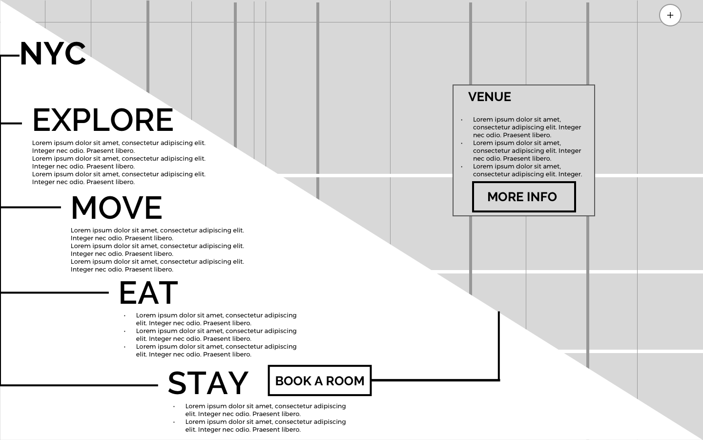
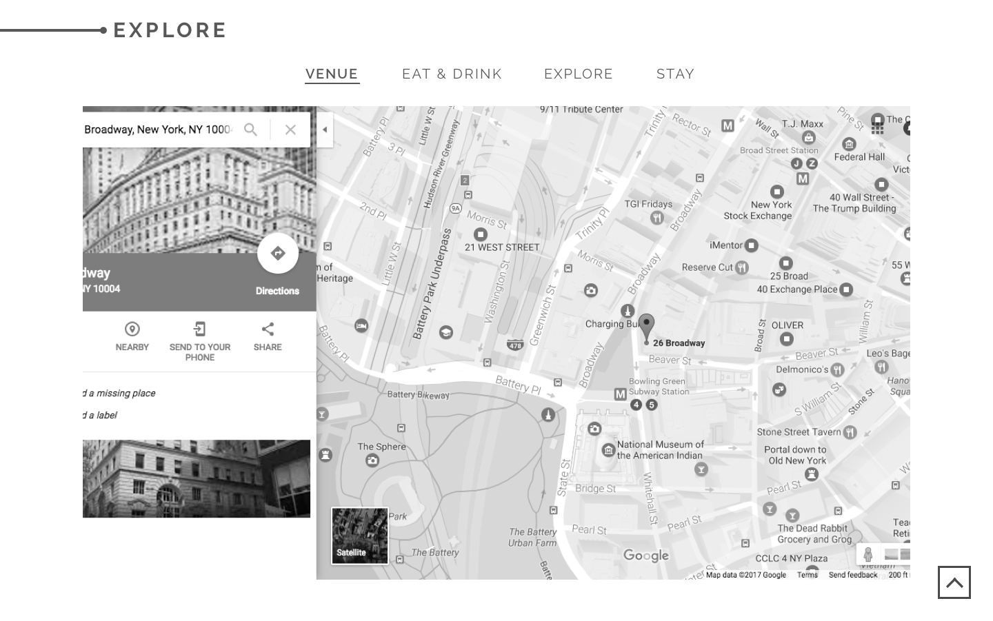
Only in New York
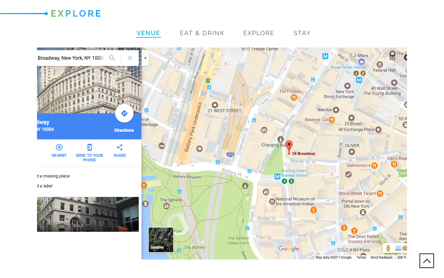
We decided to highlight the locale of the conference, downtown NYC, by creating a separate section.
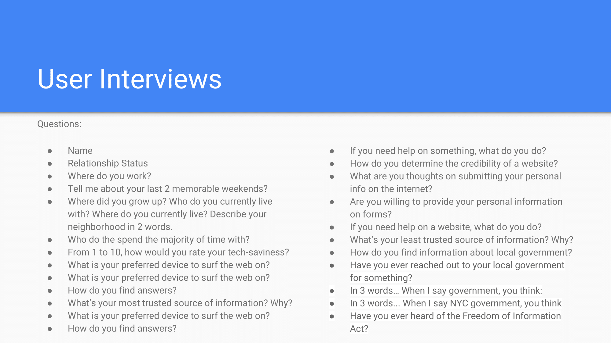
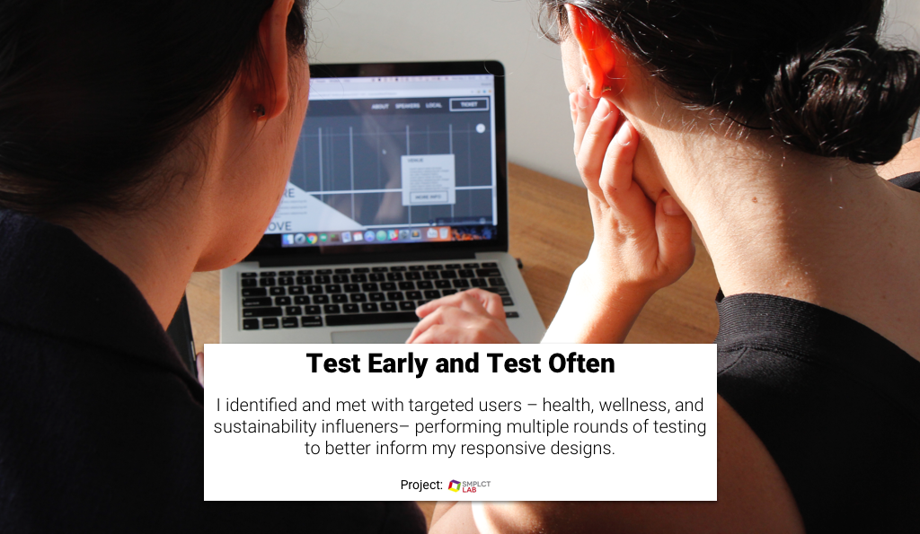
HOW WE FOUND USERS TO TALK TO AND TEST WITH
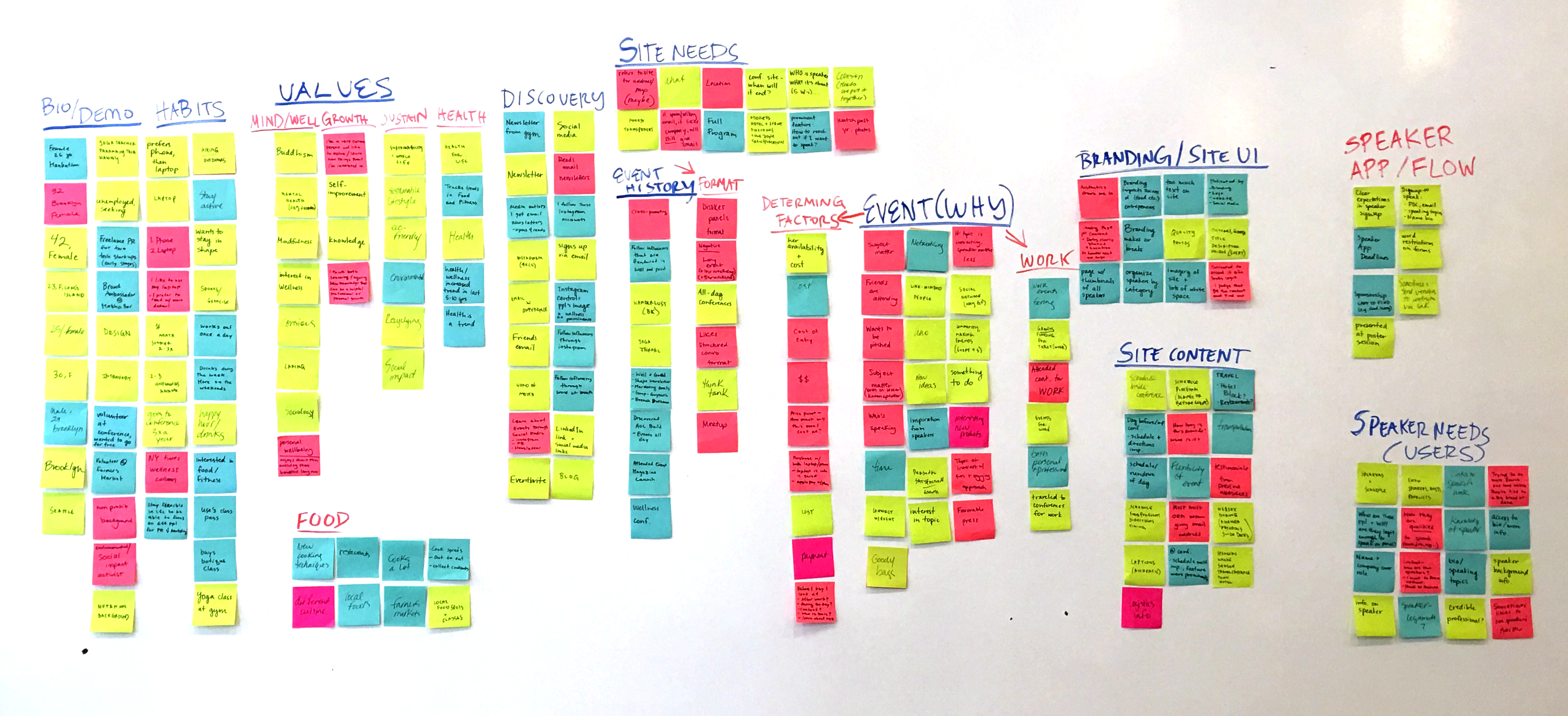
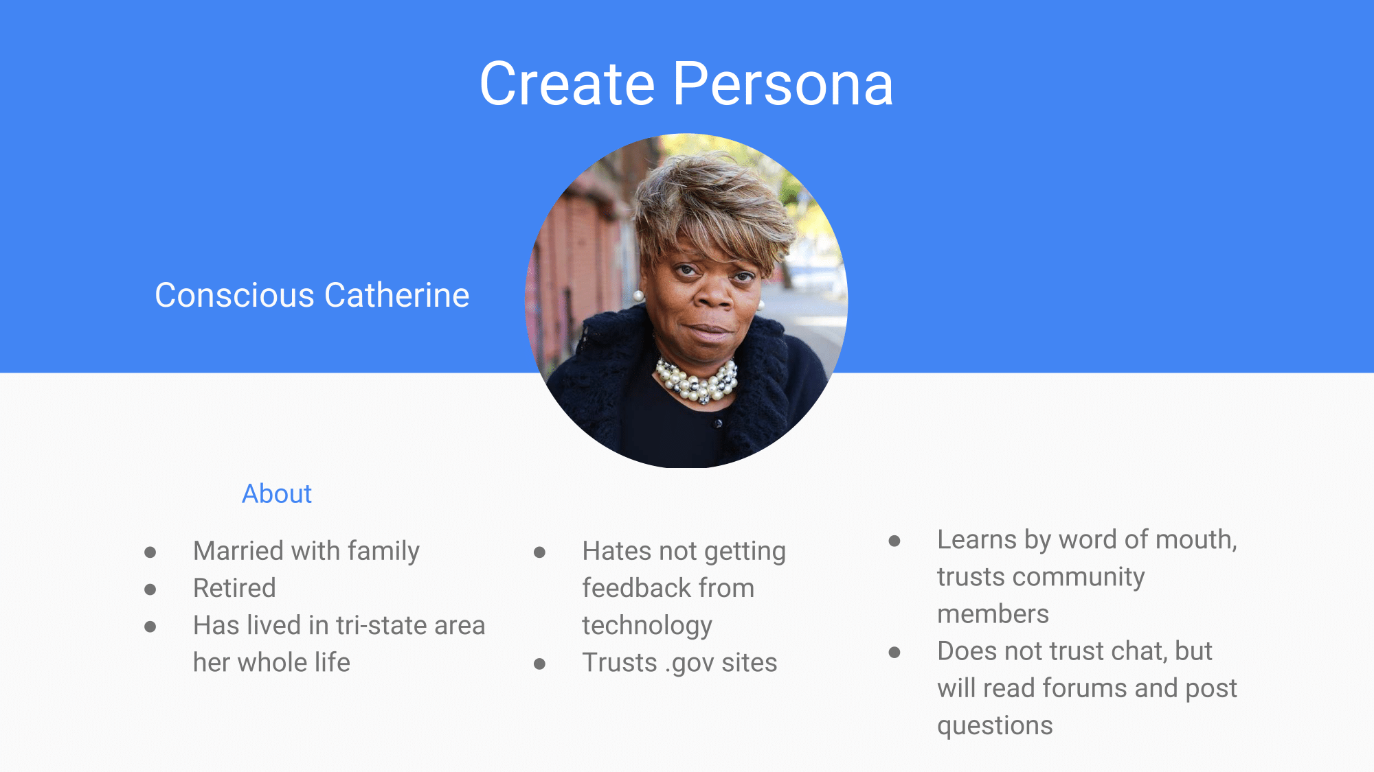
WHAT WE LEARNED FROM TALKING TO USERS
SITE NEEDS BASED ON TALKING TO PEOPLE
“AESTHETIC draws me in. I think if it looks more legit, it is more legit. I judge that before any of the content” - 26 yr. old, Primary User
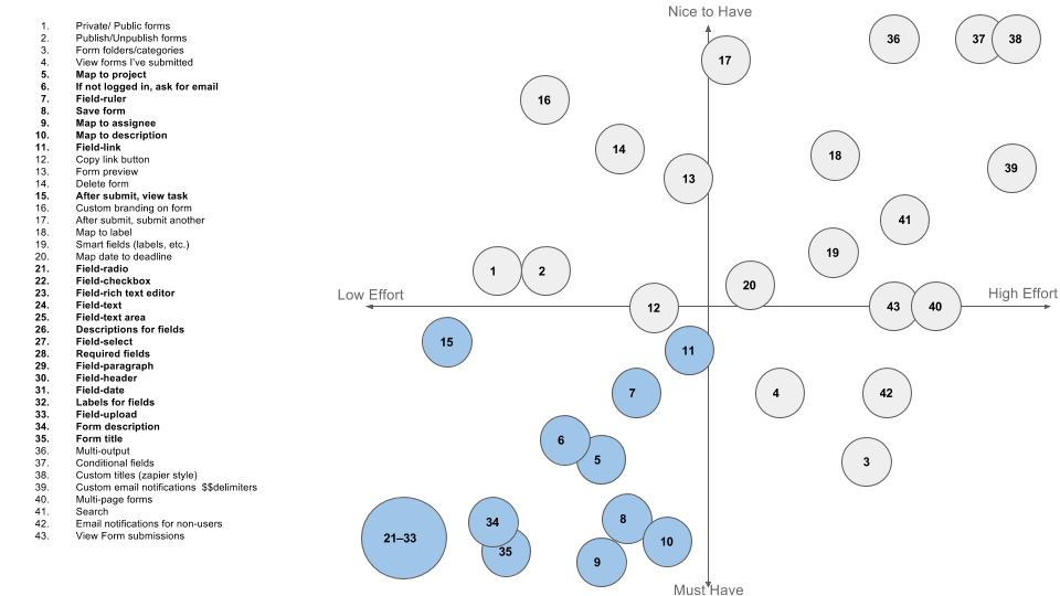
FEATURE PRIORITIZATION:
SINGLE PAGE + INFINITE SCROLL
HERO AREA
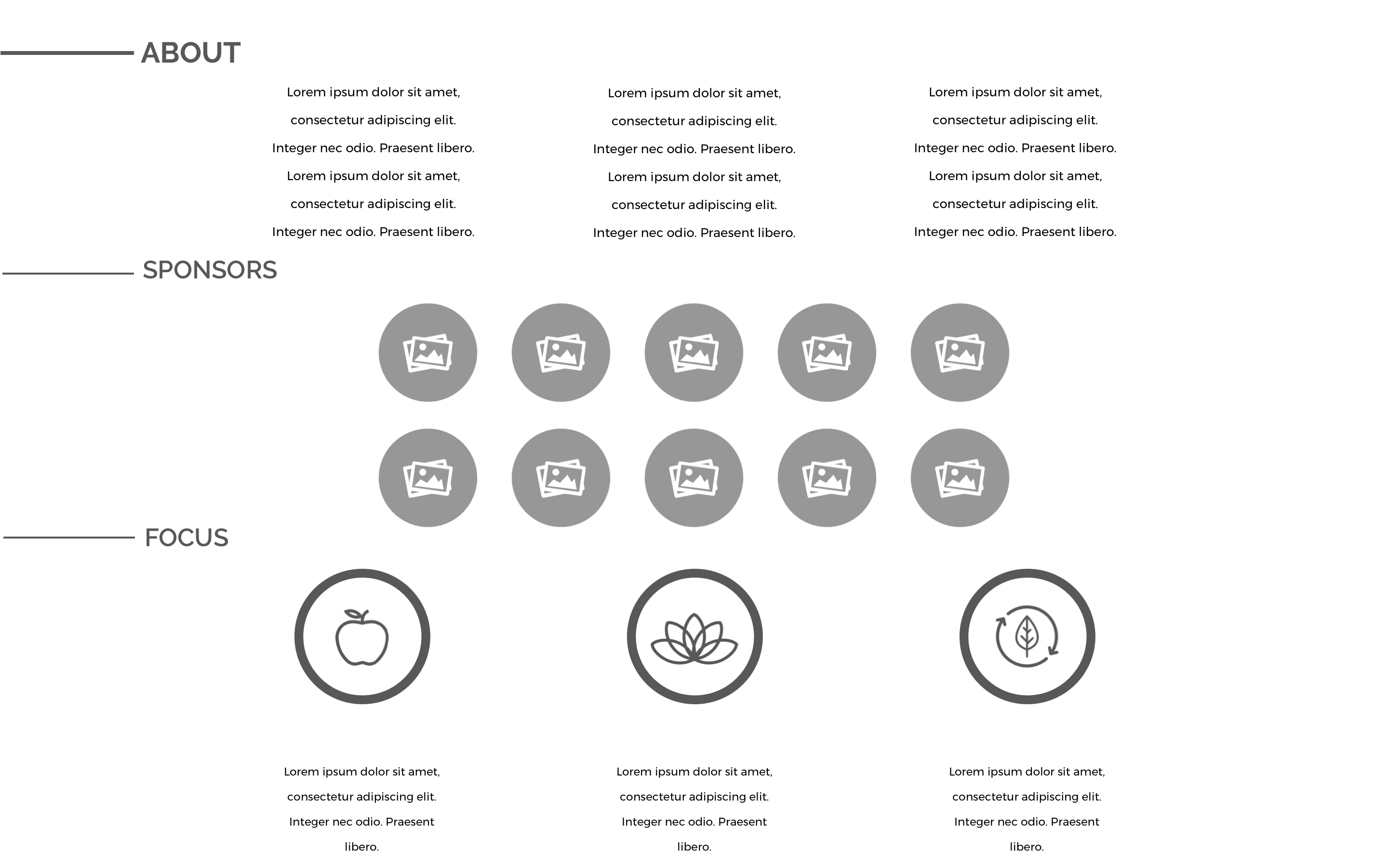
ABOUT
FOCUS
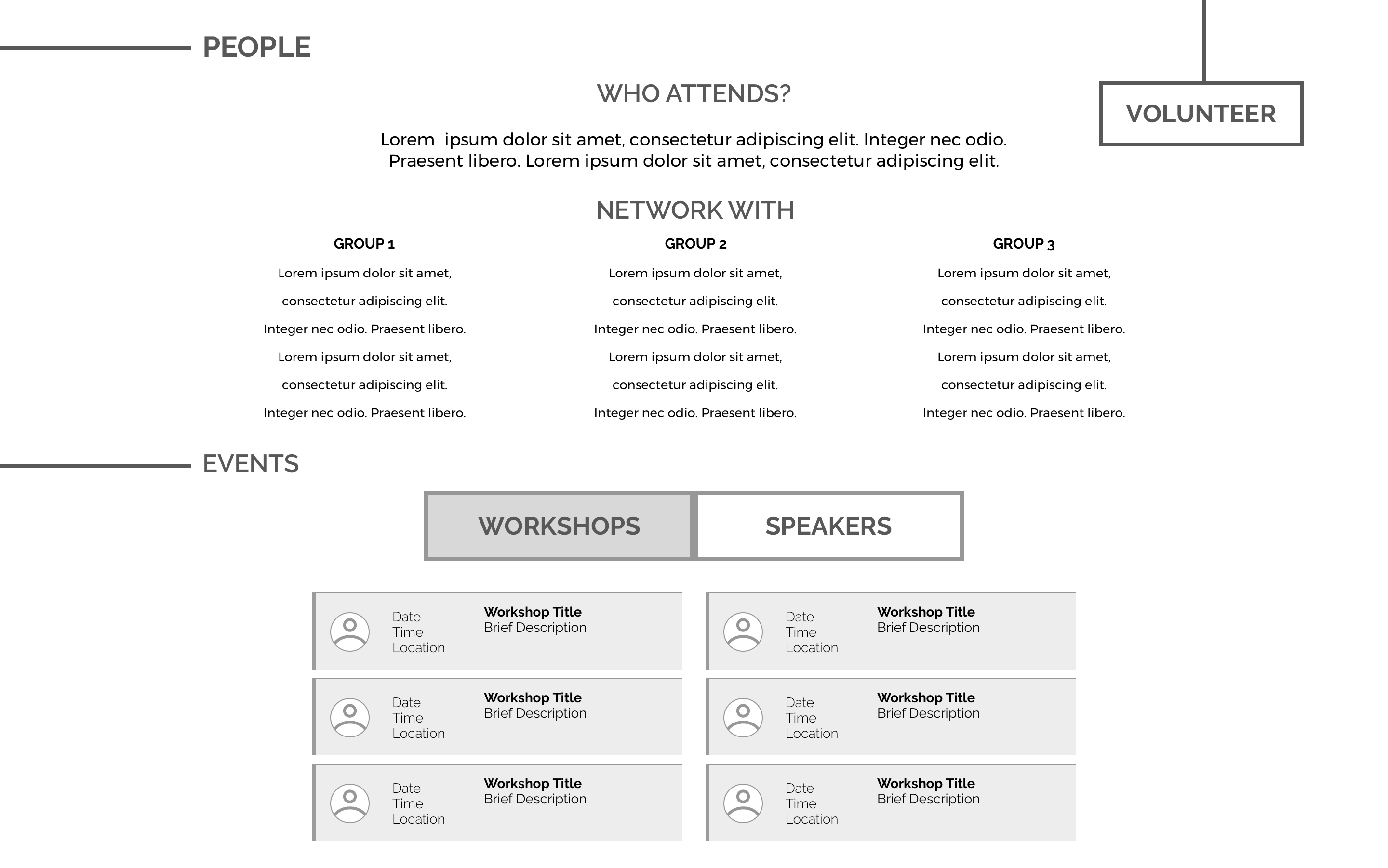
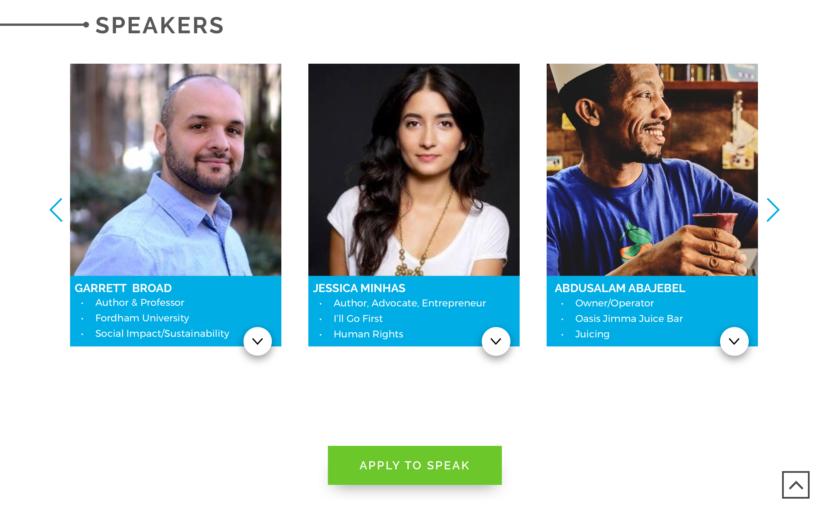
SPEAKER
EVENT - Feature City
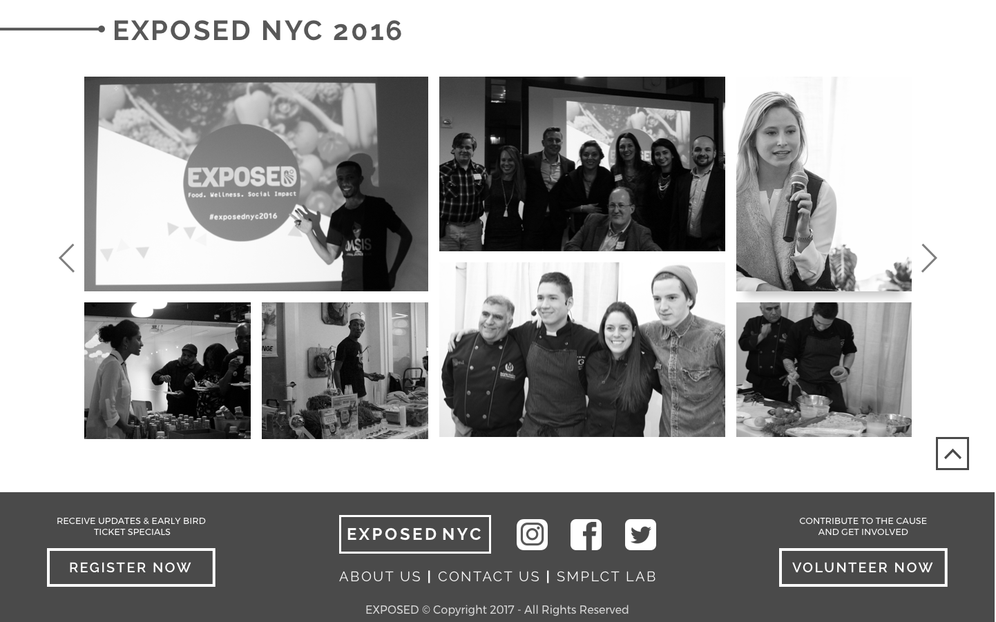
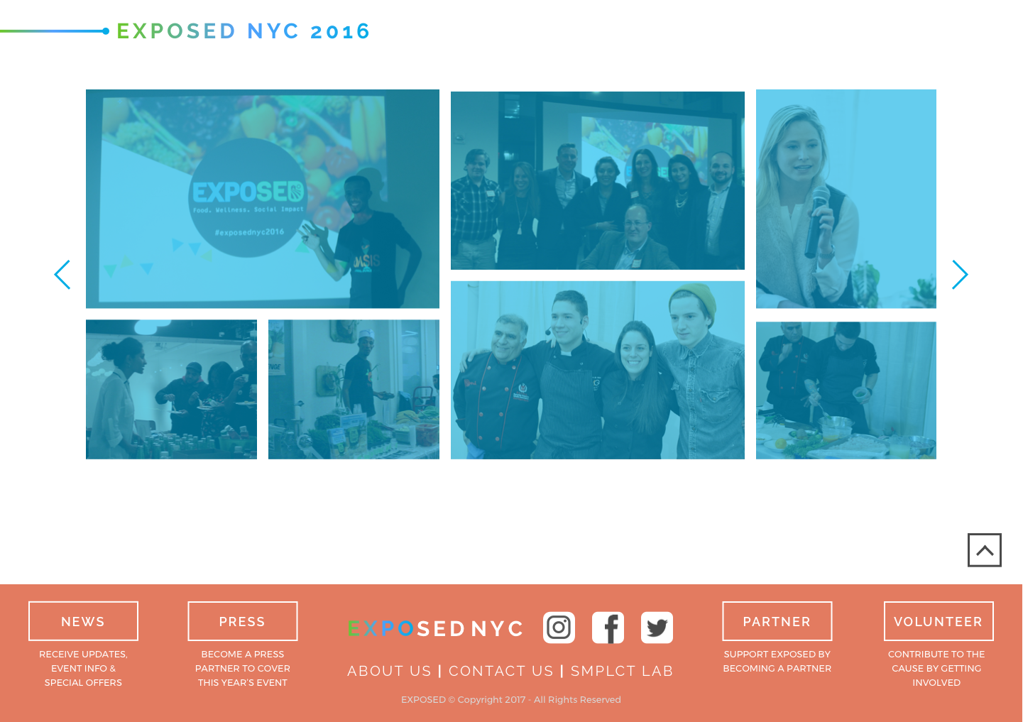
LAST YEAR
SPONSOR
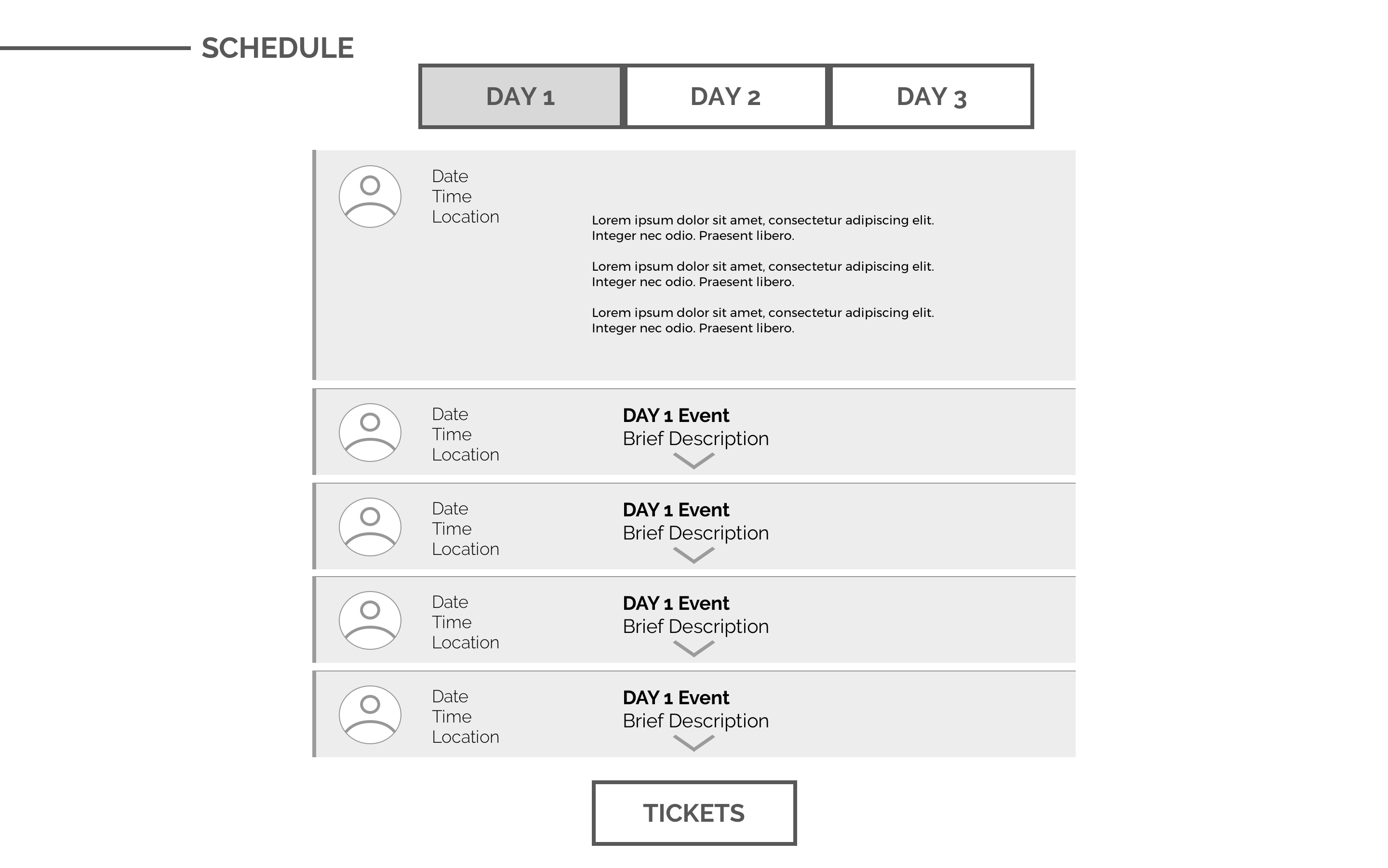
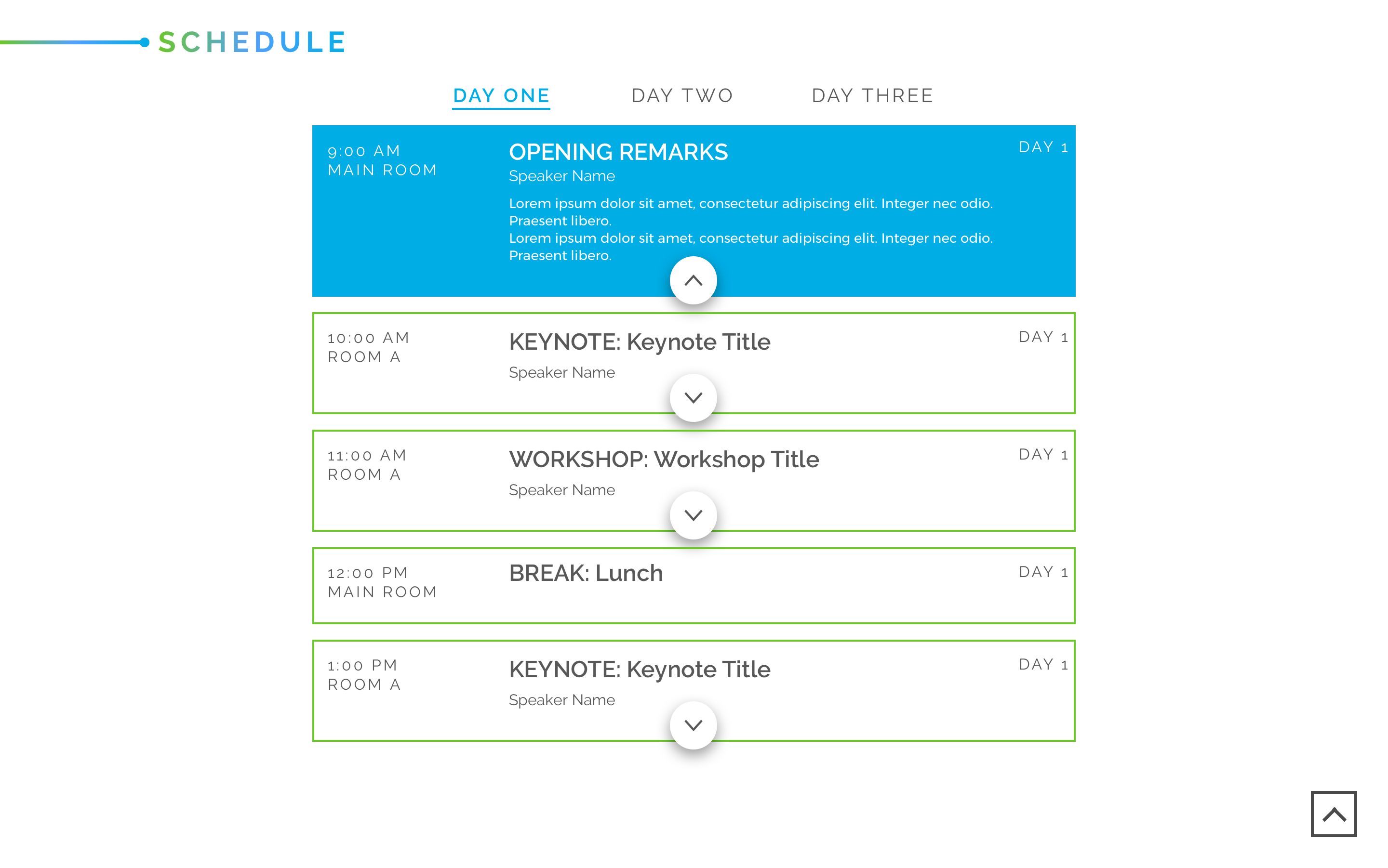
AGENDA
Name That...Section!
To increase effectiveness of the navigation, we performed a folksonomy test to choose the section names. Similar to card sorting, users were given term cards to rank in order of what they would expect to see on a health and wellness event site.
LOCAL: 2
NYC: 1, 2
DISCOVER: 2, 2, 2, 1
EXPLORE: 1, 1, 1, 1, 2
EVENTS: 1, 1, 2
PROGRAM: 1
AGENDA: 2, 2, 2
SCHEDULE: 2, 1, 1, 1
REGISTER: 1
SIGN-UP: 2, 1
ATTEND: 1, 1, 2
PURCHASE: 2
TICKET: 1, 2
TICKETS: 2, 1
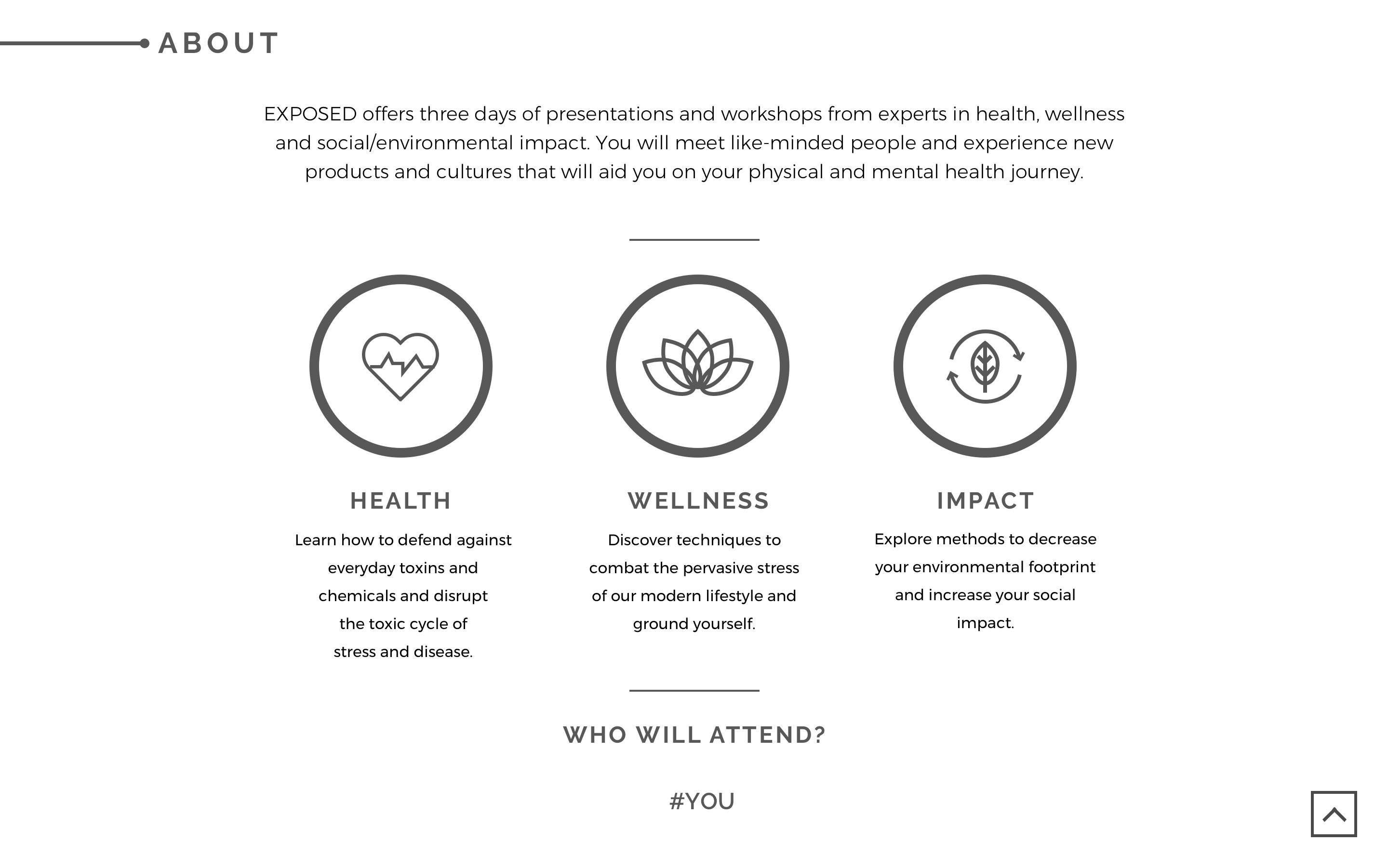
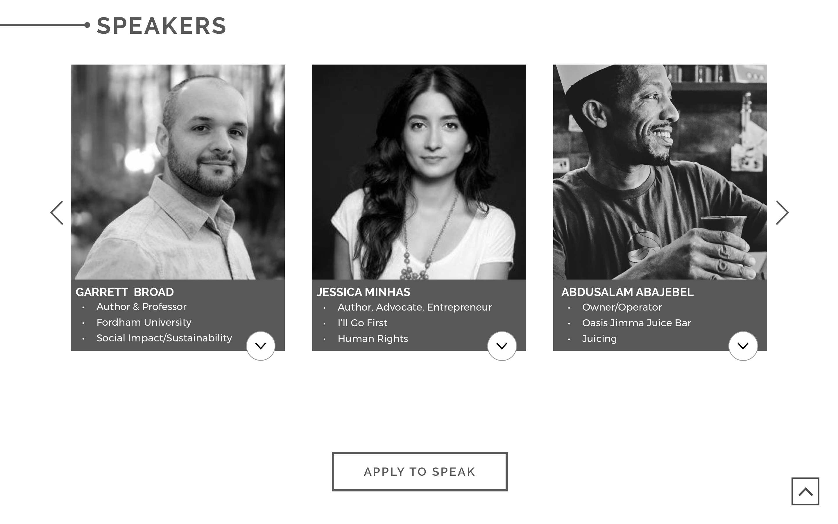
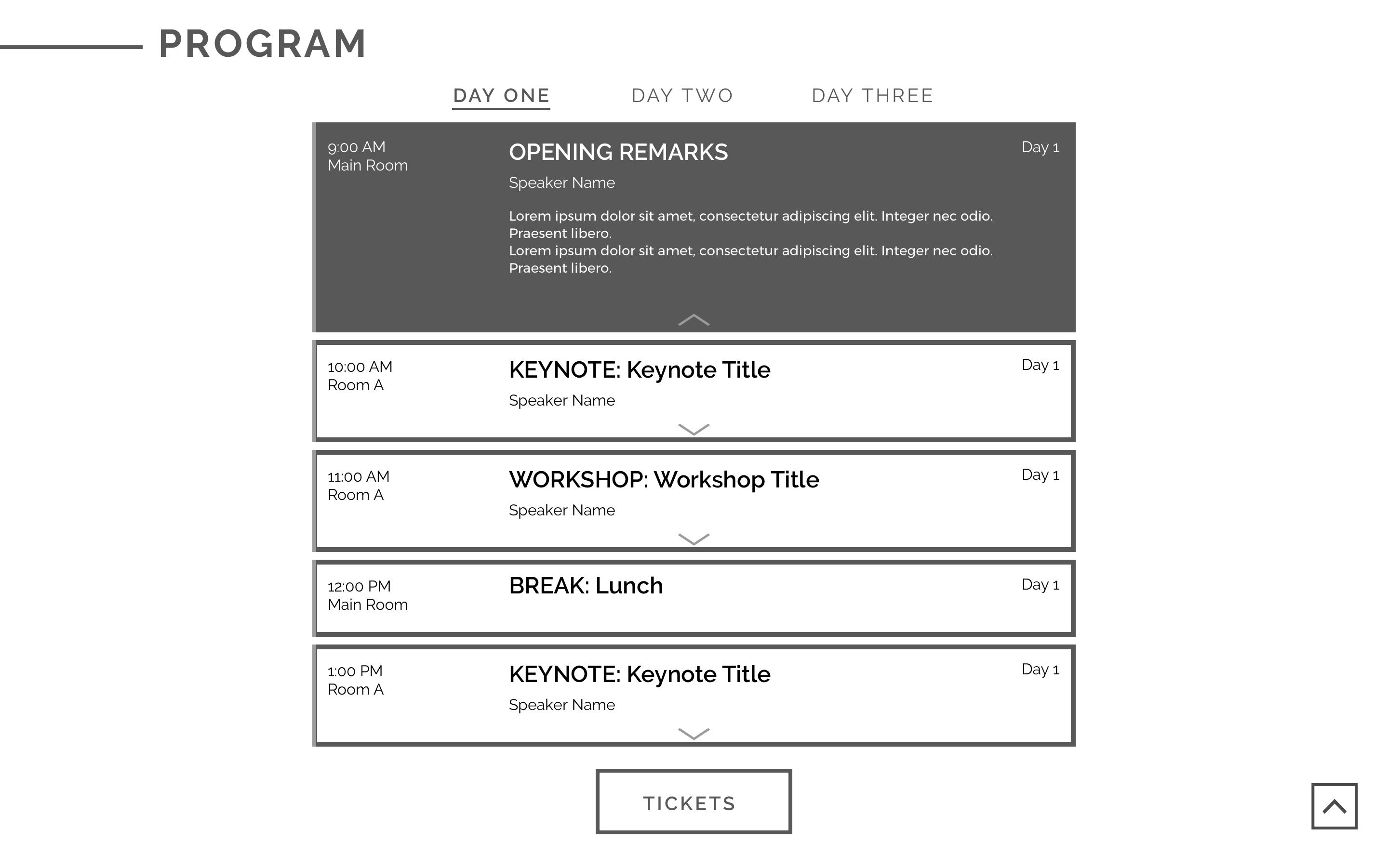
Check Out Our Designs
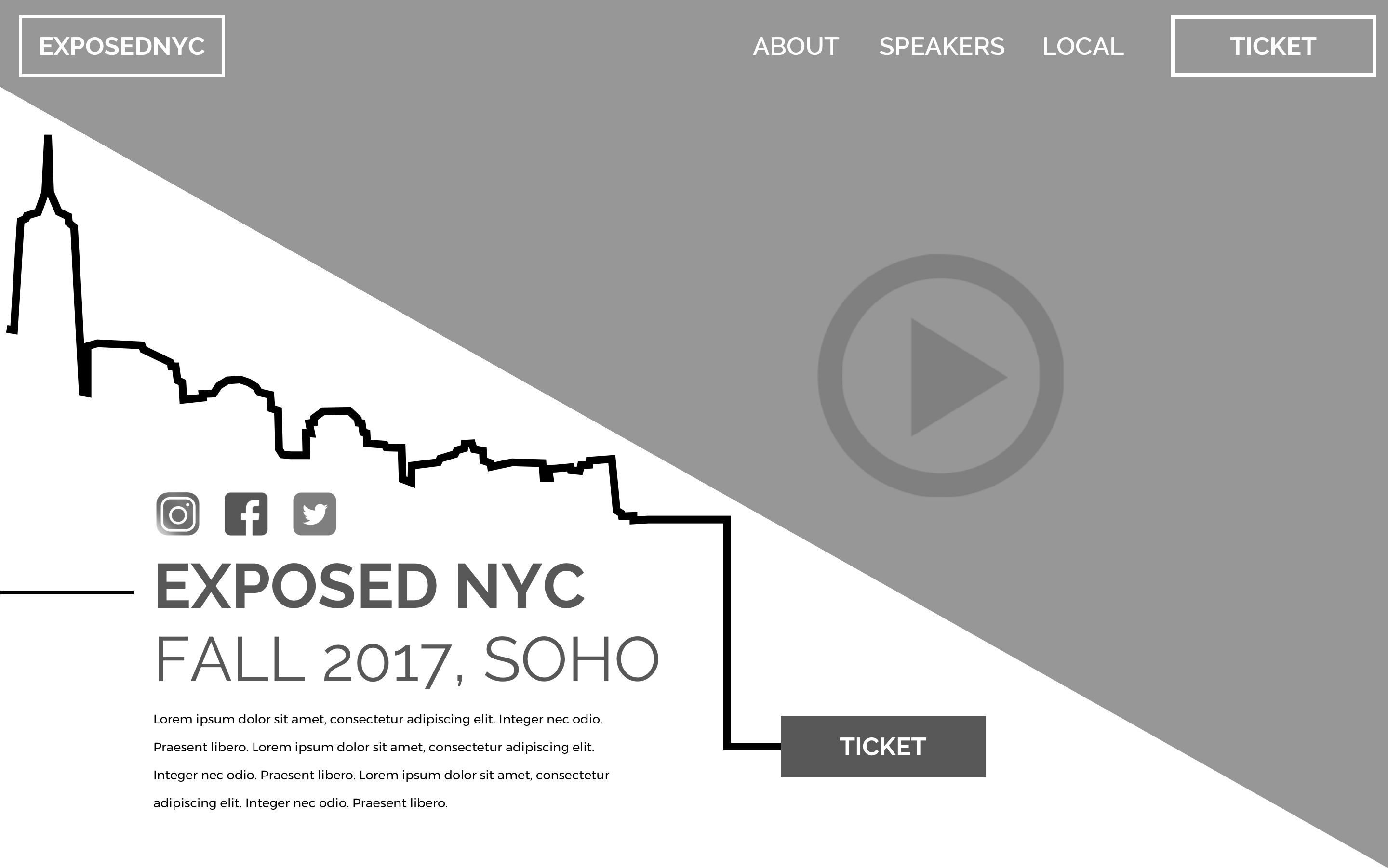
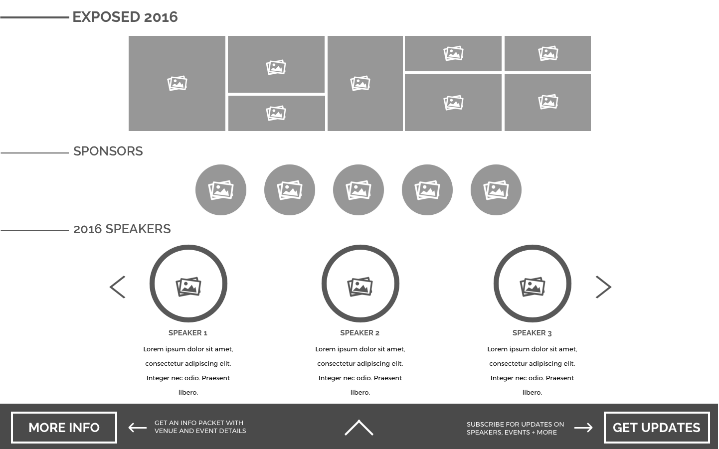
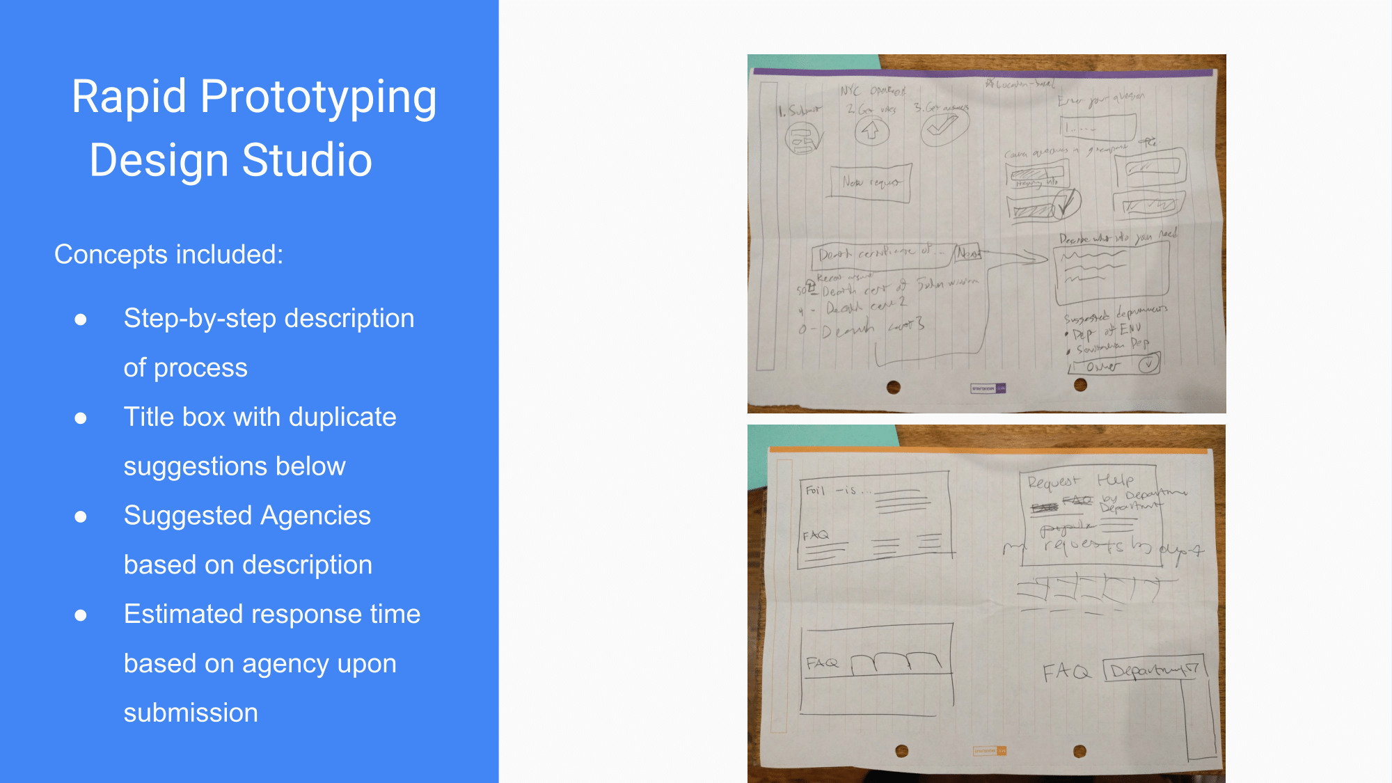
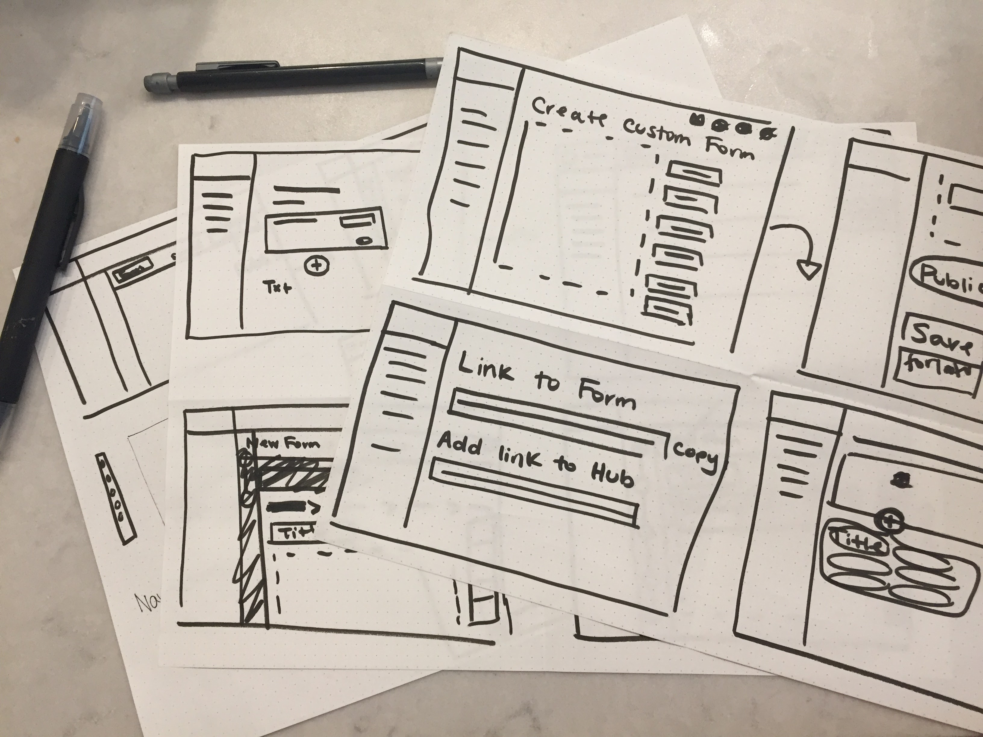
Low-Fidelity
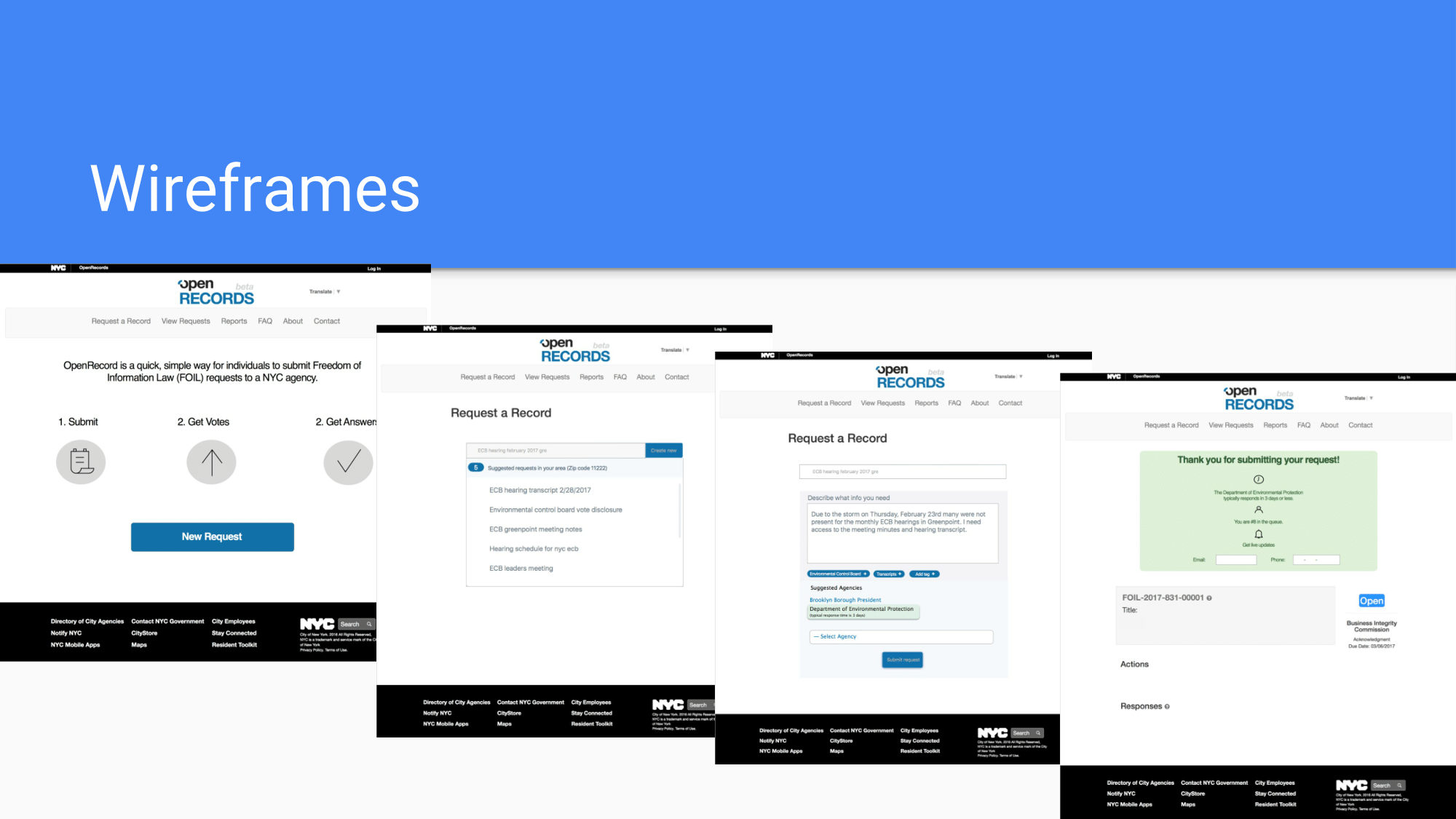
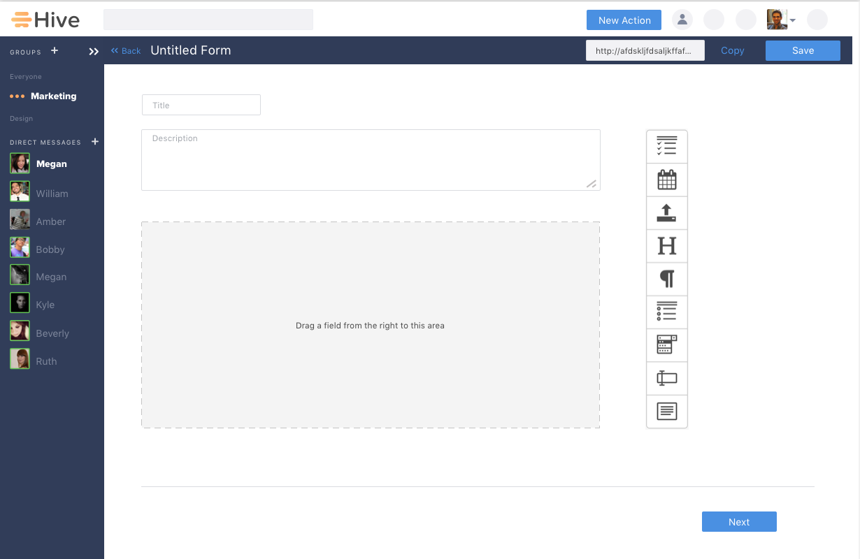
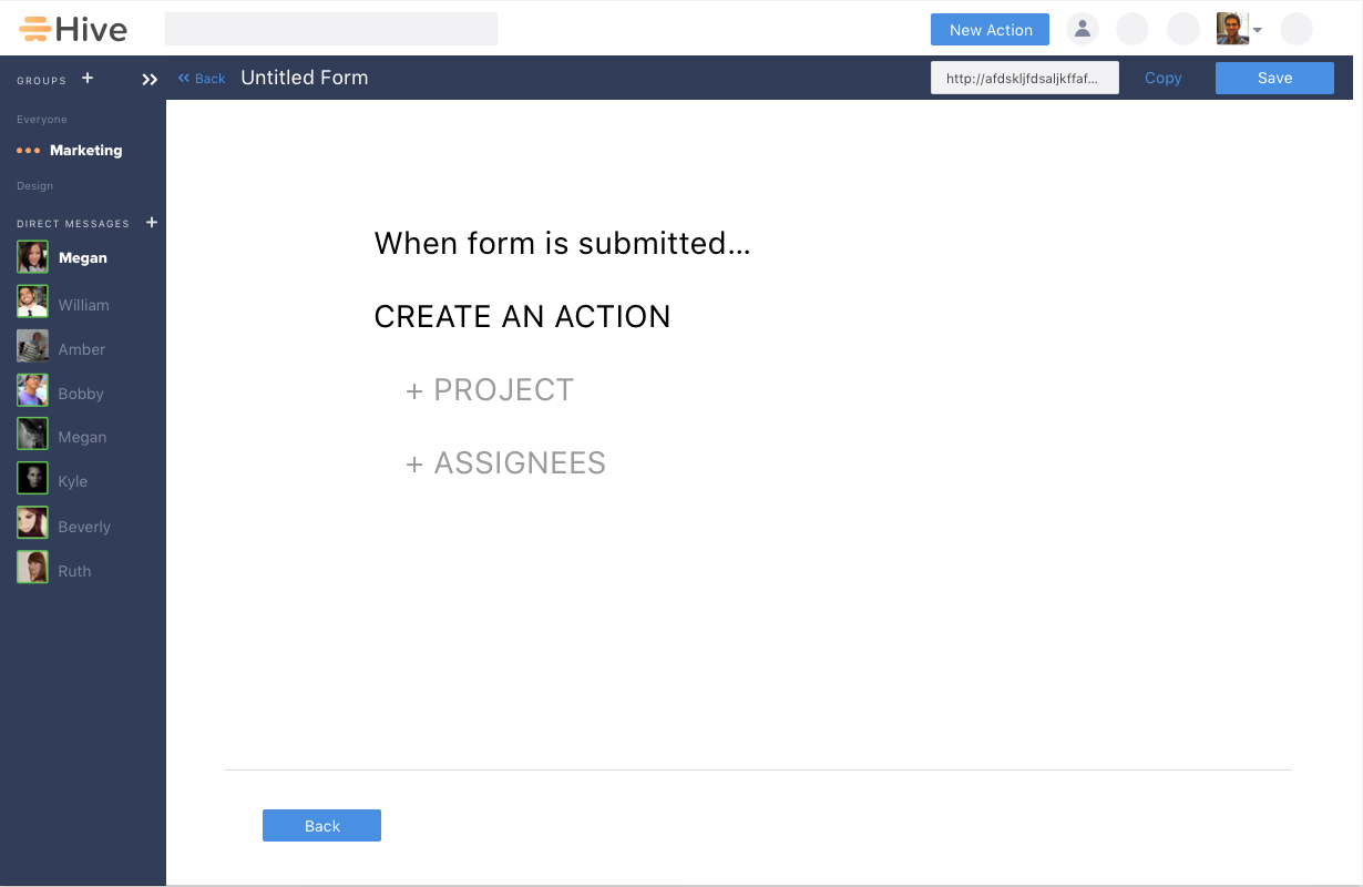
Mid-Fidelity
High-Fidelity
Handing Off The Designs to The Dev Team
Before passing off our annotations, we sat down with the developers and walked them through our designs and the functionality we believed would be low effort with a high impact to the user experience. By meeting as a team, we were able to talk out potential issues and tweak a few recommendations to better fit our team's resources.
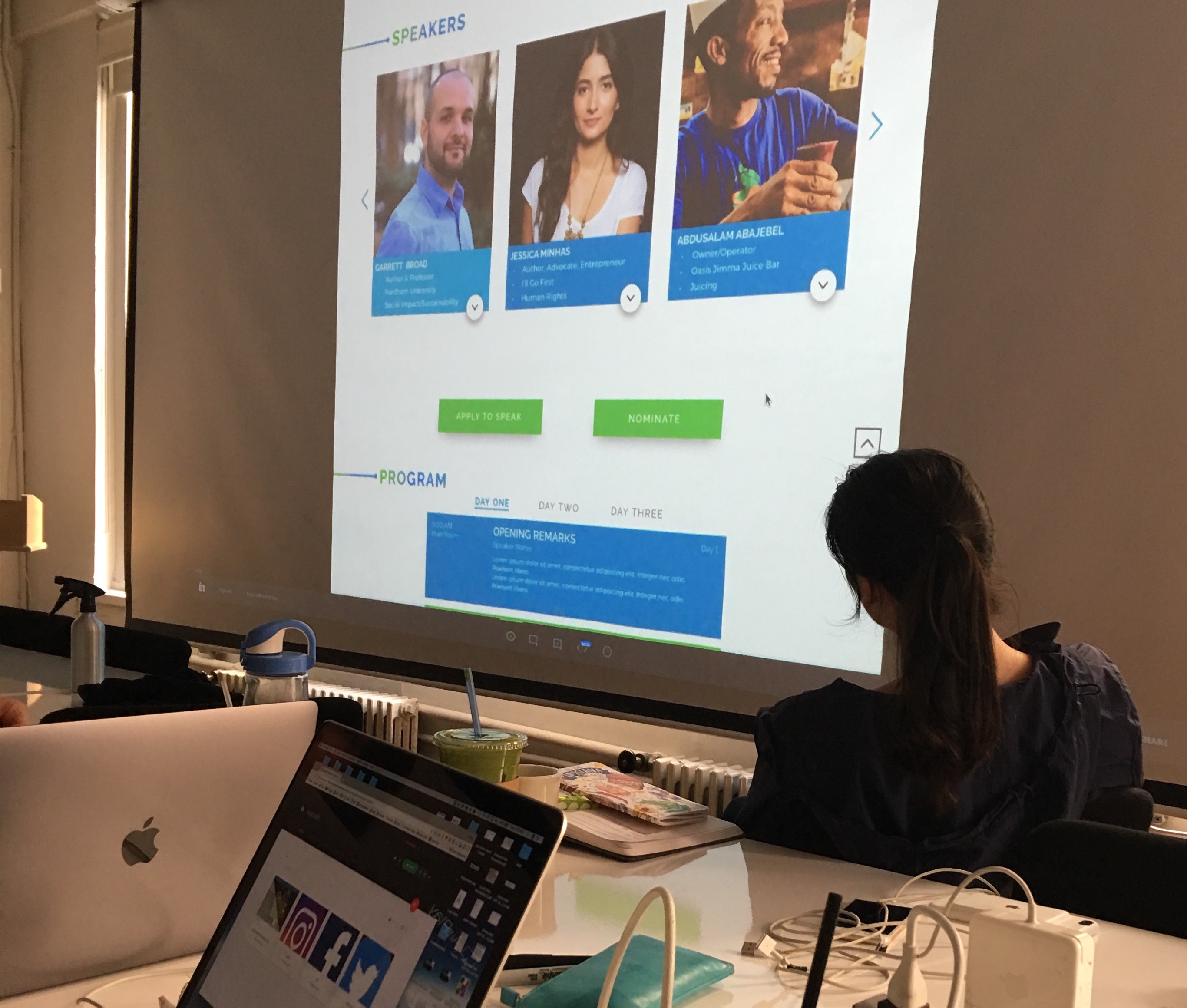
Bringing The Designs to Life
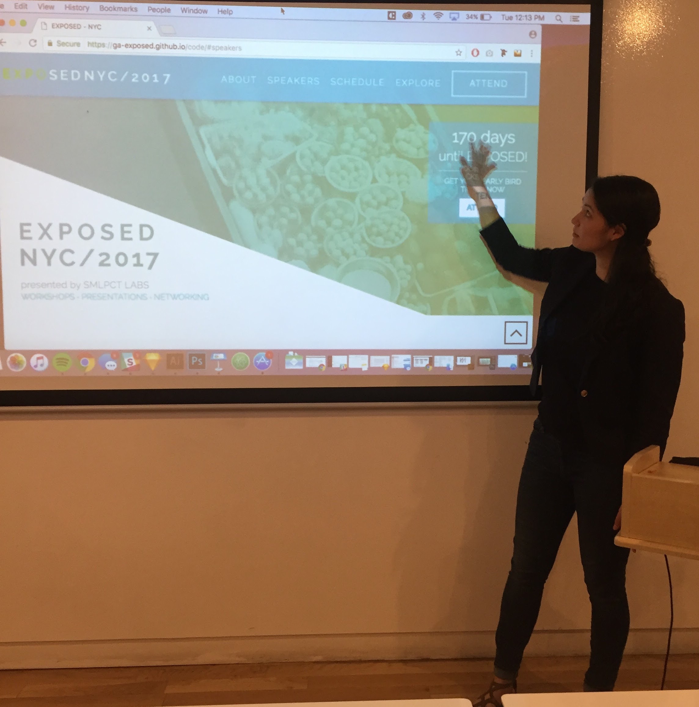
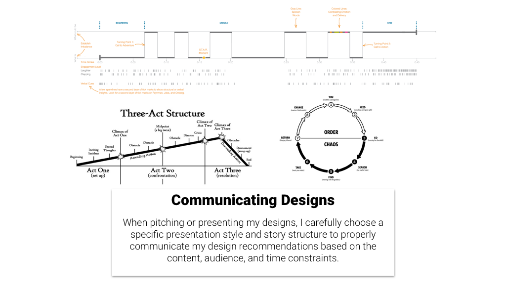
Utilizing a three act story structuce, we built a presentation catered to our client to highlight the potential impact from each of our designs. We presented an overview of the designs with the completed and active website to the CEO and Development Strategist.
